
Conversion up 83%, from 0.6% to 1.1%+, in two months.
Boosted Safe sells a steel car safe disguised as a booster seat. From September 1 to November 1, I rebuilt everything a shopper touches and most of what they never see, using Claude Code and a crew of agents: 192 pieces of work, a home page cut from 60 MB to 14 MB, and email signups up 56%. Here's how I did it, and the decisions that made it work, including the tests we lost.
Conversion rose from 0.6% to 1.1%+ in two months.
The store was at about 0.6% when I started, and I launched at 1.1%. Email signups rose 56%. Orders with two or more safes went from 3.0% to 14.1%, on a small sample, once a clear multi-safe deal replaced old joke discounts. The home page dropped from 60 MB to 14 MB.
Conversion is the headline, and the next chapter explains how to read it while tests run. The rest comes from Shopify, Klaviyo, Search Console and Lighthouse, and each one says what it's measured against.
0.6% to 1.1%+, and why the live number reads lower while tests run.
The store was at about 0.6% when I started. I launched at 1.1%. Long-term, the goal set at kickoff is 3.5%, and this is the first big step toward it.
Since launch we've kept testing on live traffic. An A/B test holds part of the traffic on another version of the site, and when that version loses, it pulls the store-wide figure down for as long as it runs.
We're about to end the tests, and then the store goes back to the winning version.
The product was clever, and the old store buried it on a phone.
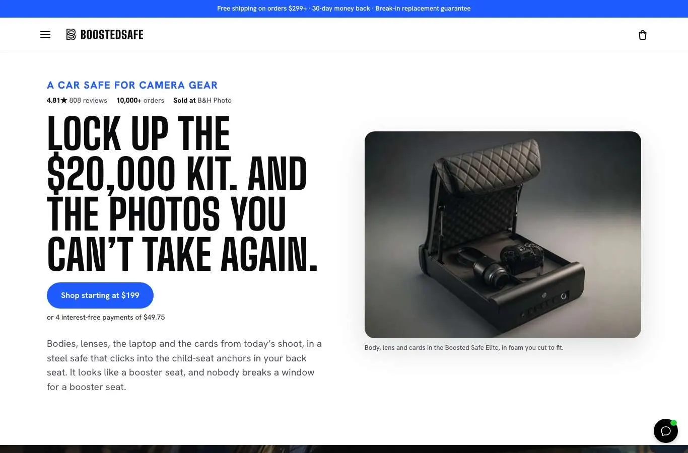
Boosted Safe clips into the child-seat anchors already in your back seat, hides under a booster-seat cover, and opens with your finger. It's patented, and it's a great idea that's hard to explain in one glance on a phone. You can see the live store here.
The store gets about 3,000 sessions a day, with about $3K a day going into Meta. 84% of sessions come from phones, and more than half arrive from Facebook and Instagram, mostly inside those apps' own browsers. The old site met them with a discount code in the top bar, a pop-up over everything, and a product page that asked you to read a diagram.
I took on the whole storefront. My first rule to the agents, in my own words: "number one priority is we don't do anything to take down or affect the current site." Everything was built on a draft until the night it went live.


Captured September 4, before I touched anything.
Two months, kickoff to Black Friday. The new theme went live October 13, 18 days late, and the old one was never needed for rollback.
Before designing anything, I read everything.
Two weeks of this came before a single layout. It's why the site says what it says, in the order it says it.
- Live site audit
- Captures, a written audit and a four-week conversion plan.
- Ten-lens expert teardown
- Personas, mobile UX, copy, growth loops, strategy, brand, funnel psychology, SEO and GEO, the Shopify stack, competitors. Ten agents, ten written reports, with raw crawl and review data behind them.
- Teardown and blueprint
- Page-by-page diagnosis and a new structure, run through CEO, design and engineering plan reviews.
- Six-source data pull
- Shopify through ShopifyQL and the Admin API, GA4, Google Ads, Klaviyo, Meta and Judge.me, all read only, saved as dated snapshots.
- Persuasion strategy
- Six layers: understand, ethos, pathos, logos, proof and honesty, the ask. Ordered differently for each page type.
- Objections checklist
- Pulled from reviews. Fit came up 71 times, price 44, fingerprint setup 39. Those three shaped whole sections.
- Ad comment harvest
- 192 real comments and 14 customer photos from the store's ads. Those comments later became the tool picker.
- Review library
- 808 Loox reviews pulled from the public widget, tagged by product, with a shortlist for each page.
- Who-buys analysis
- Read only the company field and email domain across 10,073 past orders and grouped them by profession. It gave the credibility section real data. Personal data deleted after.
- Patent found and used
- US 12,618,282 B2, granted May 5, 2026, with its real figures on the site.
The hero stat was wrong, and the true one was better.
The store said a break-in happened "every 36 seconds." When I went looking for the source, it was old and it was about stolen cars.
FBI data gives one reported theft from a vehicle every 45 seconds. The Bureau of Justice Statistics finds police only hear about one in four. That works out to about one every 11 seconds. So the site now says one every 11 seconds, and prints the math and the citations right under it, on a dial. A claim about 60,000 stolen guns got the same treatment and became a sourced figure from Everytown.
The true number turned out to be the stronger one. It usually pays to go and look.
A checkout spike turned out to be phantom events.
From August 26, the numbers looked like a breakthrough. On the same ad spend, add-to-carts doubled. It was tempting to credit Meta's optimization. Purchases, though, fell 12%.
I traced the start to the day a theme was published. That publish was firing phantom cart and checkout events, and the pixel passed them to Ads Manager. It stopped on September 5. Without that trace, everyone would have spent months reading bad data as good news, and the baseline would have been wrong too.
I built this with agents, and I stayed the one making the calls.
Nearly all of this came out of one long Claude Code session, September 4 to November 1, with more than 500 messages from me. I gave direction, reviewed in real browsers, and approved anything that touched the live store. When I was away from the desk I drove it from my phone with Remote Control.
Agents let one person cover what used to take a team. They also run ahead, get things wrong with confidence, and will happily make things up. So most of the craft here was in the setup: who plans, who writes, who checks, and what no one is allowed to do.
- A planning model and worker models
- My rule on Sep 22: "Fable should plan and assign work but other models ... will be great for lower thinking work once there is a pattern." It went into the repo's instructions. Mechanical passes went to cheaper agents, each in its own git worktree, and none of them push to Shopify.
- Parallel agents with narrow jobs
- Ten teardown experts. Three theme researchers. SEO, GEO, landing page and article writers. Each got one job and came back with a written report or a draft.
- Expert panels as critics, not authors
- Copy, conversion and mobile personas reviewed the work. They raised problems, and I decided. I reused the panels for landing page reviews and test reads.
- I stopped it when it ran ahead
- Sep 16, in my words: "I did not want you to just start down the path of doing everything on that list... I need to work with you to get my expertise into the work." From there we went item by item.
- I asked for engineering discipline out loud
- Sep 23: "i don't want a custom site that is tons of hobbled together custom different things." That led to written rules and a clean-up pass, covered in the theme chapter.
- Calls became to-do lists
- Every review call went in as a transcript and came out as a feedback list and action items.
- Scheduled agents kept working after hours
- Daily security check, daily indexing queue, daily SEO log that drafts the next article and publishes nothing, daily Clarity read, a monthly AI answers test, and reminders for the sale switch.
- Skills I built for the client to keep
- A brand skill with tokens, voice and claims. A blog writer skill with facts, approved wording, a never-write list and the keyword map. They can use both without me.
- Tools around the agent
- gstack skills for plan reviews, investigation and QA. Impeccable for design and contrast checks. Claude in Chrome for signed-in dashboards. Granola for call notes.
Some things were simply off limits to the agents.
Agents can do real work on a live store when some things are simply off limits. These were the limits.
- Draft only until launch
- The push tool can't reach a live theme. Publishing was a person's click, and on launch night I gave that call myself.
- Blocked means stop
- Permission checks stopped several live pushes and admin clicks. They weren't worked around. I ran those steps myself or handed them to the owner.
- Passwords and customer data stay out
- The agent never typed a password. No customer personal data went into context. The one order export was read for company and email domain only, totaled up, then deleted.
- Undo before every edit
- Most deliverables have a before or rollback folder. Store changes run by script with a dry run and a way back.
- Claims tests in the code
- Tests fail the build on hand-typed financing, placeholders, blocked photos, or a font used where it shouldn't be. Certain safety claims are banned outright in the repo rules.
A claims gate caught a real error.
Agents drafted the articles and the video pages. Nothing published until a claims check passed. That gate cut 69 spoken lines from transcripts and held 2 videos back.
Then a writer agent, reading the transcript of the store's own pull test film, noticed that wording on a live page didn't match what the film shows. That's an error, and it's being corrected. The fix is written and committed, and it's on its way live.
That's the case for agents with a gate: more eyes reading more of your own material than any person has time for, and a rule that says the record wins.
Nothing invented ships.
That rule came from my own misses. Early persona pages had made-up customer stories. There were stand-in faces and an AI founder photo. All of it came out, and the founder block now uses a real video frame.
19 looks and 14 rounds of feedback got a yes in about two days.
I built homepage directions fast using one shared copy kit, so the owner was judging looks and not wording. Six became 19. They got consolidated into a 12-page prototype in 7 skins, with light and dark, all on a client review hub on Vercel with a short guide on how to review.
The direction we landed on took its cue from onewheel.com: big type, real product, confident. Those 14 rounds of feedback happened in about two days, and the owner approved the look on September 20.
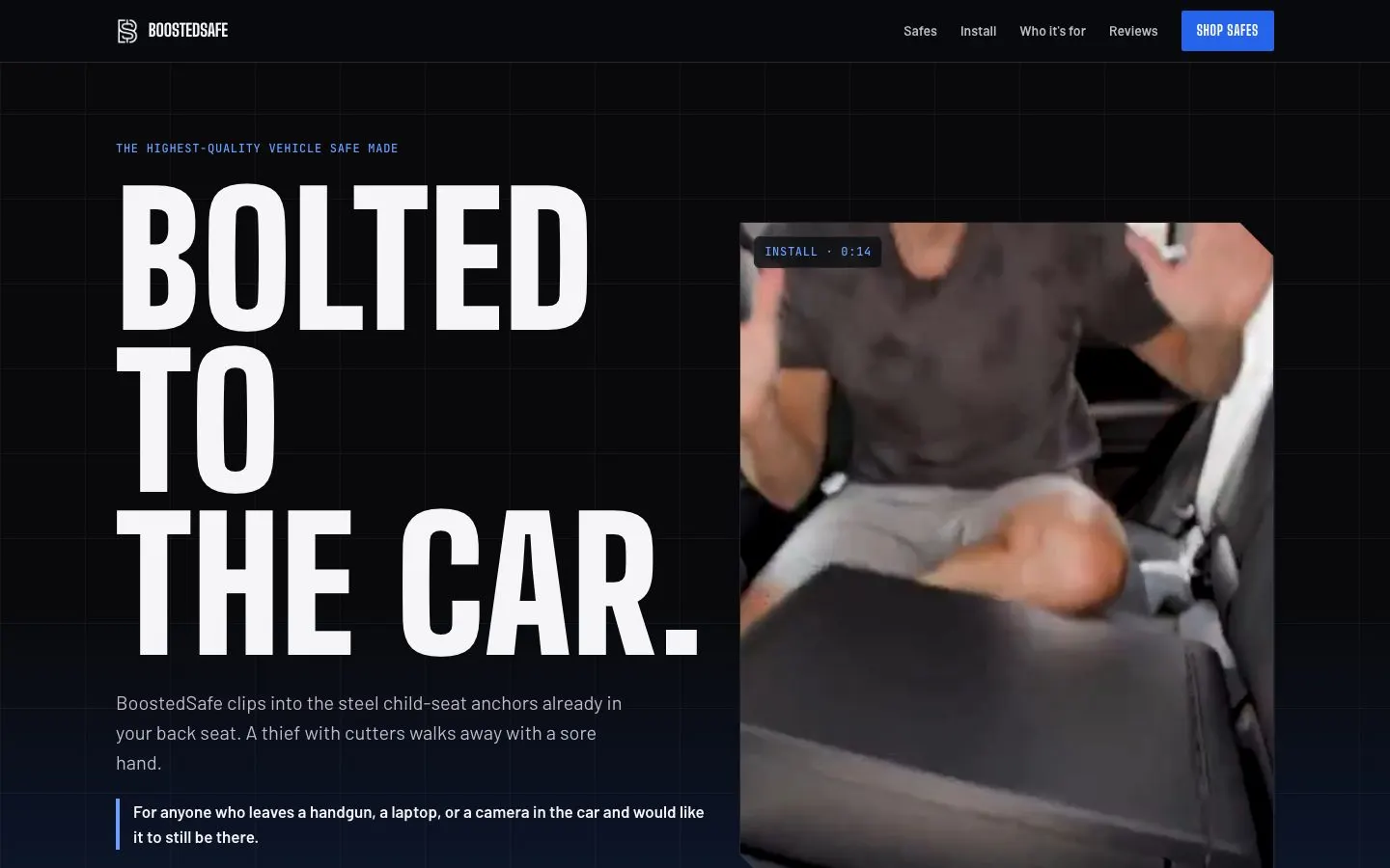
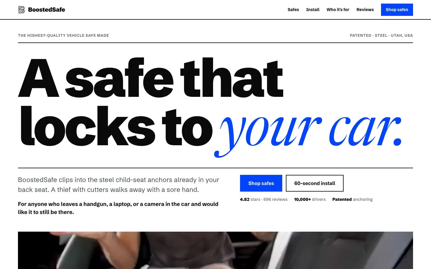
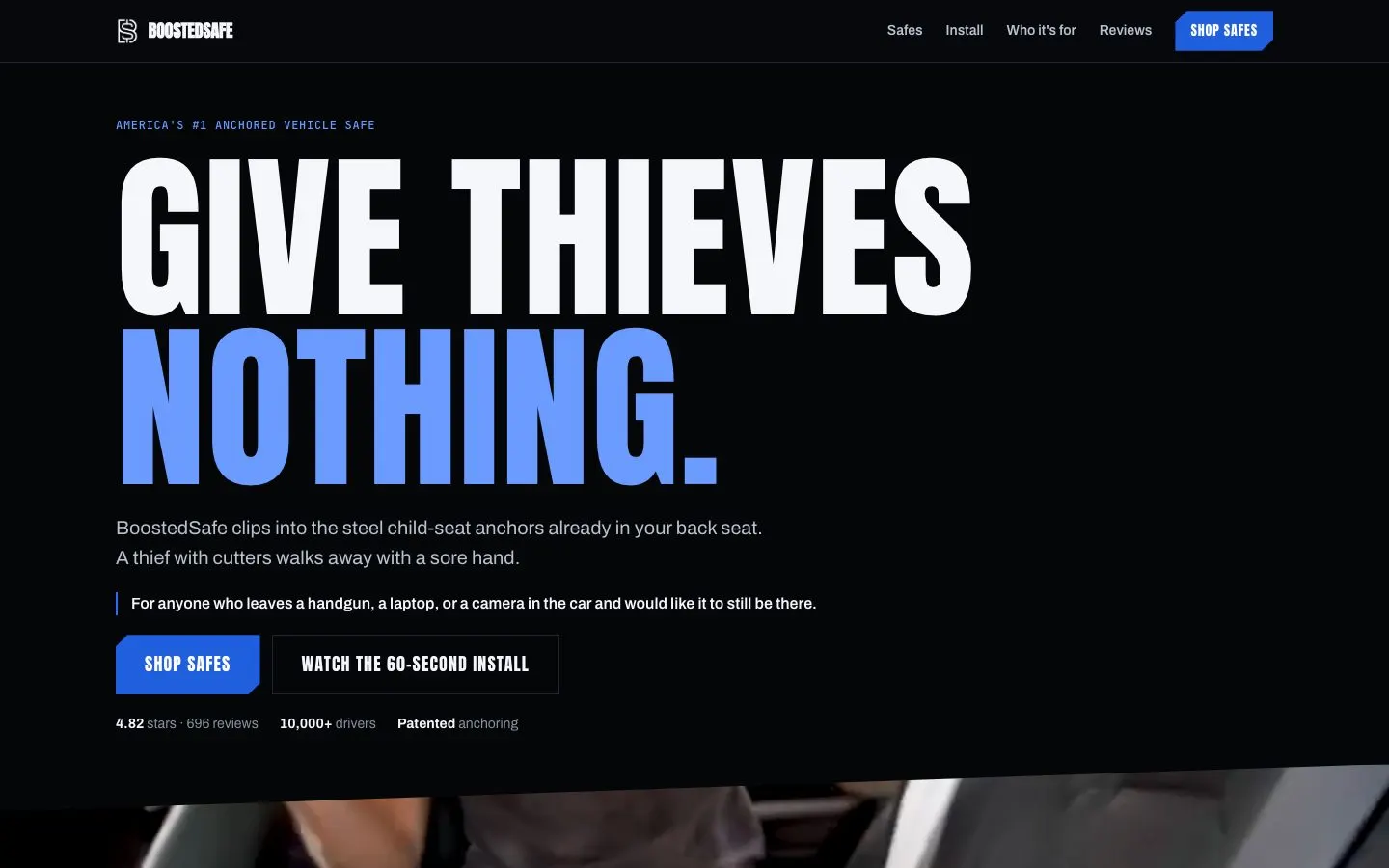
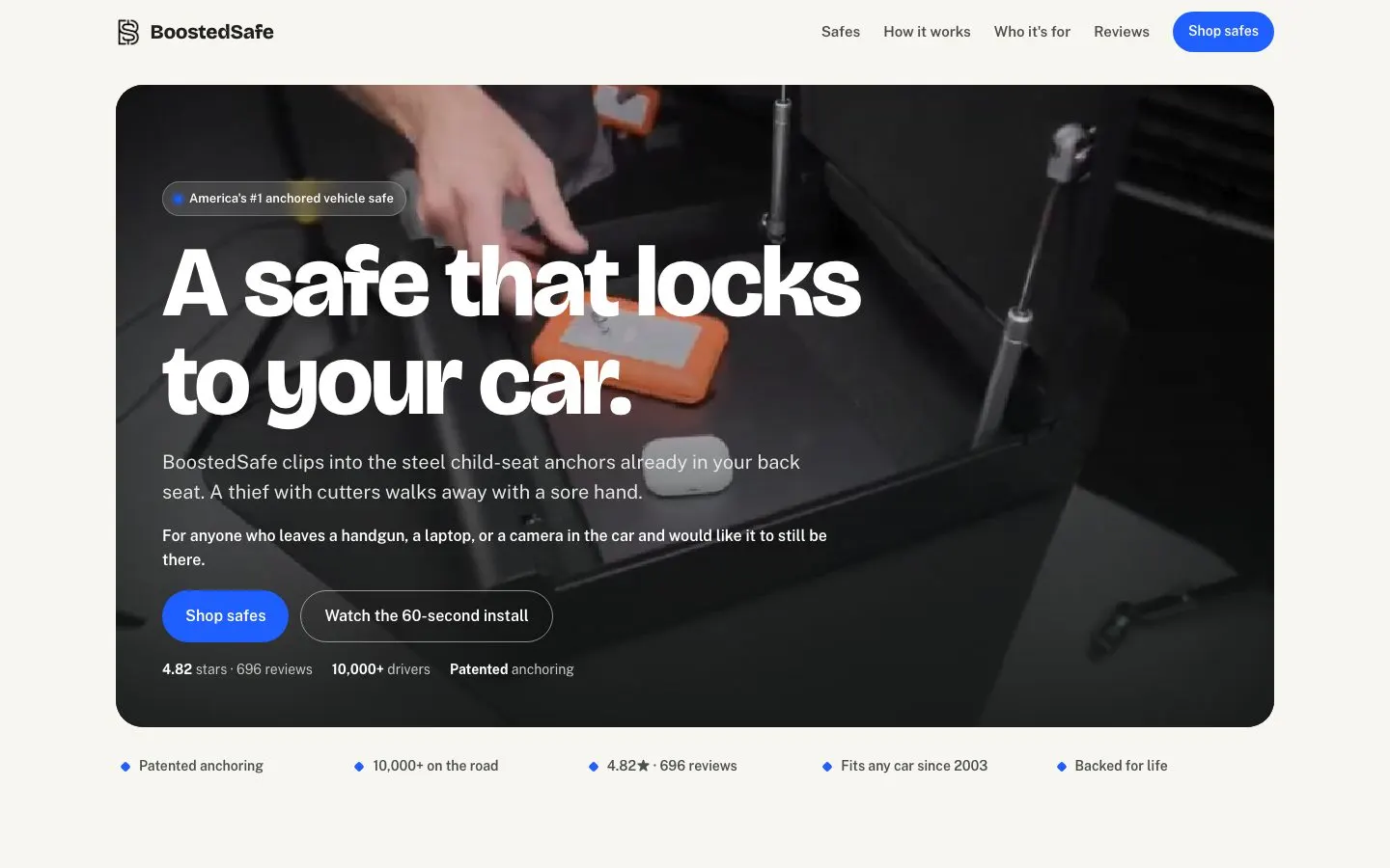
Four of the 19 directions. These were explorations and their copy never shipped.
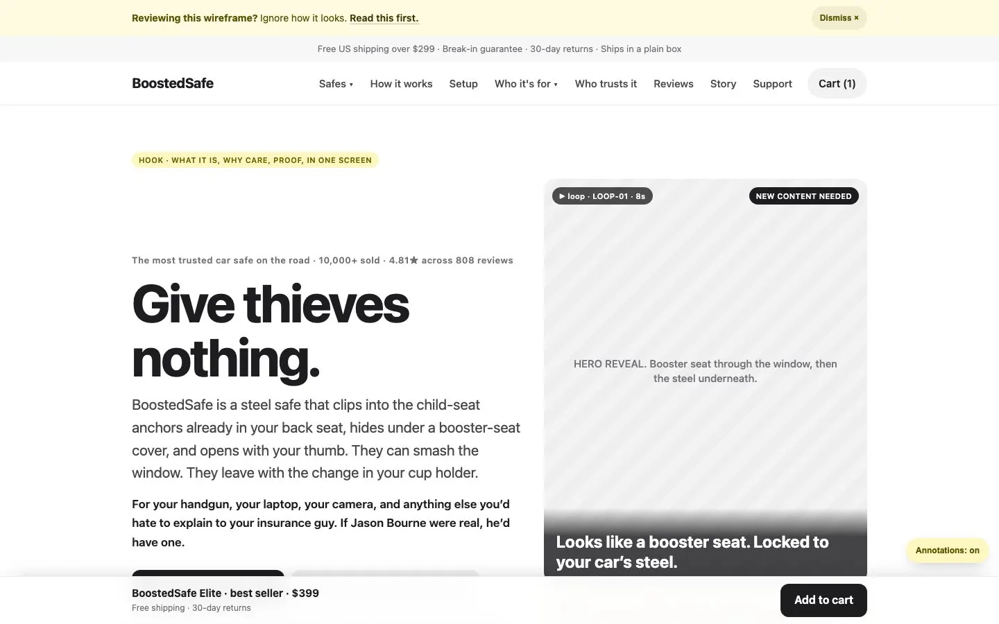
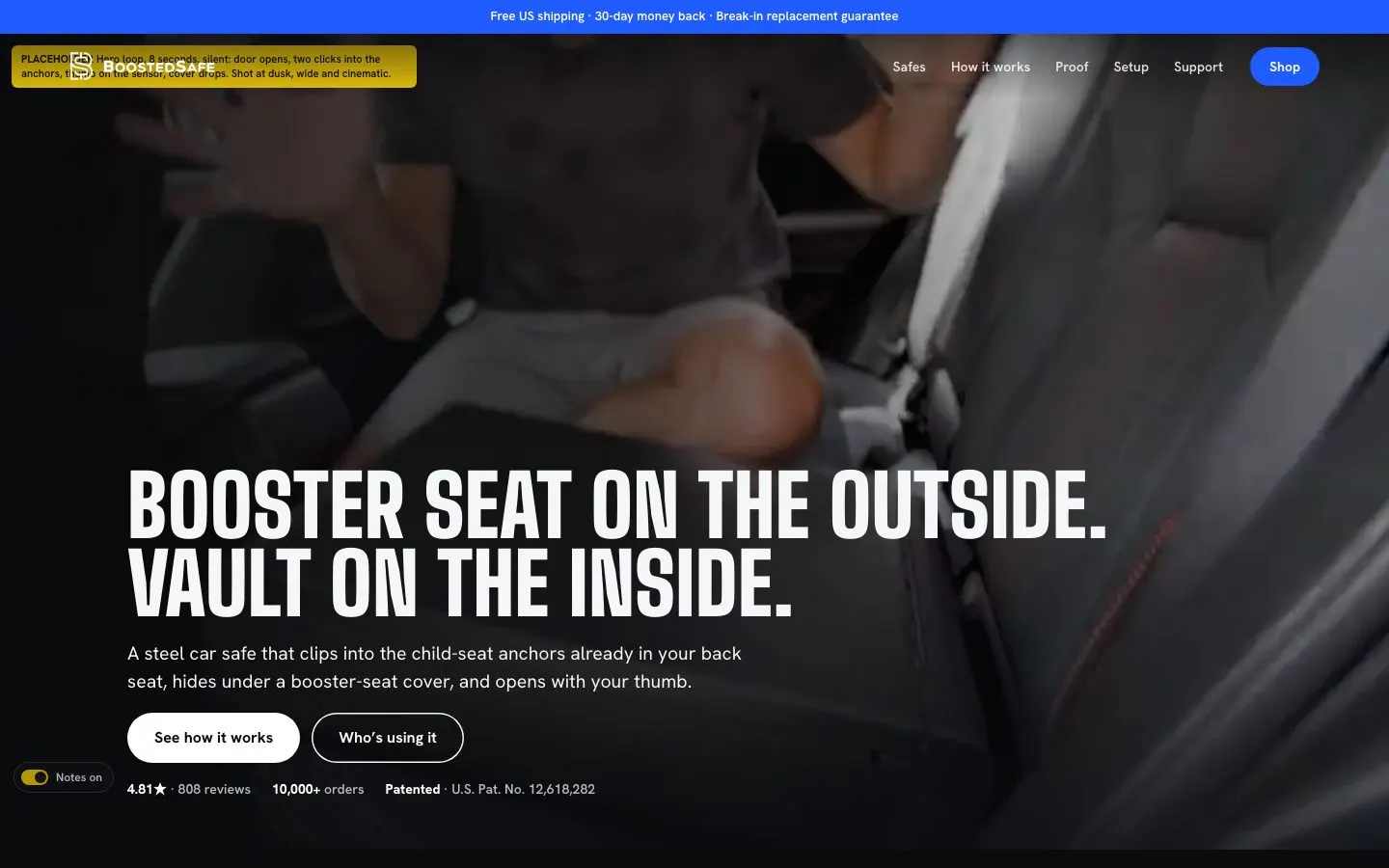
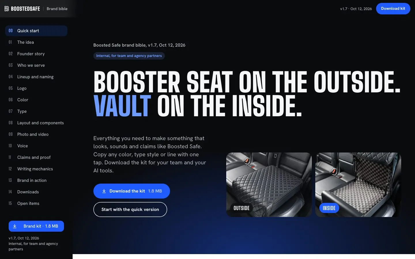
The wireframe, the approved hi-fi, and the brand bible that came later.
- Click-through wireframe
- 34 pages with real words, and a guide that taught the client to review the copy and ignore the looks.
- One generator for wireframe and hi-fi
- A single content source built both, so a copy change traveled everywhere at once.
- Hi-fi site, twice
- 34 pages in the first look, then a rebuilt second version with 111 MB of real assets.
- Headline exploration
- Options a to x, each previewable by URL. The winner: "Booster seat on the outside. Vault on the inside."
- Full-site critique
- I had it torn apart once more before writing any Liquid.
A heavier logo, and a brand bible a phone can use.
The old rounded wordmark looked soft for a steel safe. I drew a heavier squared mark and a Big Shoulders wordmark, full vector, and tested options side by side in the sizes they'd actually live in, down to a phone header.
The brand bible is a phone-first site with copyable values, downloads and a gallery. Its colors and type read from the theme, so it can't drift away from the store.
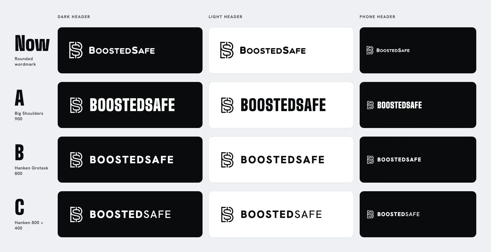
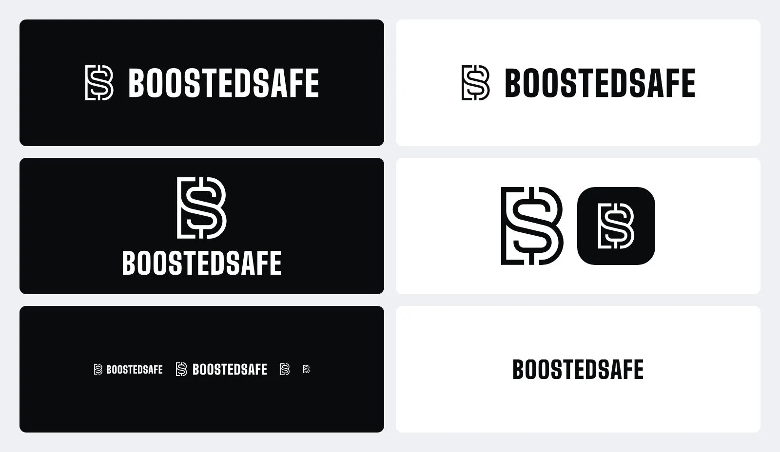
Logo options tested at the sizes they'd live in, down to a phone header, then the final heavier mark.
- Brand bible, v1.0 to 1.7
- Live on Vercel, kept out of search, with a downloadable kit.
- Brand kit
- Tokens, a DESIGN.md, voice and claims, logos, fonts and share cards, plus the brand skill so AI tools follow it too.
- Copy
- All the site's words, under one voice rule: headlines read like a person talking.
- Shopify brand settings
- Slogan, description, cover and logos, so the store reads right in Shop and at checkout.
A custom store you can still upgrade.
I planned to build on the Impact theme. Three research agents and a check of primary sources changed my mind, and I moved to Dawn 16, Shopify's own reference theme. Dawn stays untouched apart from three fenced hooks, and everything custom sits in a separate layer. When Shopify ships an upgrade, it can come in.
On September 23 I asked how solid the build really was. That question led to written rules and a clean-up against them: inline styles went from 130 to 8, inline scripts from 3 to 0.
- Dawn plus a bs- layer
- 69 sections, 54 snippets, 81 templates and 82 assets. About 10,000 lines of section Liquid, 2,100 of JavaScript and 2,100 of CSS.
- Editable by the team
- Copy, images, buttons and links can all be changed in Shopify's theme editor, with no code and no call to me.
- One owner per thing
- Each stylesheet has one owner. No inline styles or scripts. One snippet per repeated thing. A second price component counts as a bug.
- One price, one quantity
- A single price snippet and a single quantity snippet run every buy box and card on the site.
- Tokens and fonts
- Big Shoulders, Hanken Grotesk, a mono face for the counter, and a reading serif that a test locks to the blog.
- Seed and migration tools
- Python scripts for products, landing pages, press, files, spin frames and CSS scoping.
- Guarded push tools
- One tool refuses to touch live themes. The live one runs checks, refuses uncommitted files, and refuses to overwrite settings someone typed in the editor.
- Test suite
- 38 Playwright test blocks in 8 spec files and 7 static checks, run in GitHub Actions with pinned actions. Signed-off looks get locked, so a later change can't quietly undo them.
Cold traffic won't read a paragraph, so the pages give it things to touch.
Most of the traffic is cold, from a social ad, on a phone. A paragraph won't hold those people. So the home and landing pages are full of things to touch, each one making a point about the product.
The break-ins map on the live home page. It picks a state on its own, flies in, and reruns the numbers at that state's pace.
The tool picker. Each tap plays a real attempt and stamps the answer.
The customer map. All of these are recorded from the live store, November 2.
- Break-ins by state map
- A D3 and TopoJSON map with FBI numbers and zoom by state. The California view started at about 5,800 blended circles, ran at about 10 frames a second and froze for 1.4 seconds. I got it to 1,170 and 52 to 55 frames a second, with a 4x slowdown turned on.
- Customer map
- 9,926 dots, one for each real order, placed from Shopify data against a town-level gazetteer, building up in intensity. No personal data in it.
- Break-in counter
- "One every 11 seconds" on a tactical dial, with the math and citations printed below.
- Tool picker
- 12 tools, each taken from a real comment on the store's ads, with a clip and a snarky verdict. "Sledgehammer. Done."
- Loadout calculator
- Tap what's in your car and see the total, with a preset for each type of buyer. In the ad version, a PSA 10 Charizard gets you "Okay. Maybe don't keep that one in the car."
- Smoke closer
- A WebGL stable-fluids simulation behind the final offer, with a 2D fallback, paused when off screen.
- Scroll-driven spin
- An Apple-style frame sequence for each product, built by script. I sped it up after launch when the team said it dragged.
- Steps pill
- A pinned bar naming the next section, with a progress bar, ending on the first Add to cart. Phone-first wayfinding for a long page.
- Vehicle wall
- "We fit every car," with cut-out cars including a Batmobile and a Cybertruck.
- Photo and comment walls
- Customer photos and comments that look like the platform they came from.
- Safes section
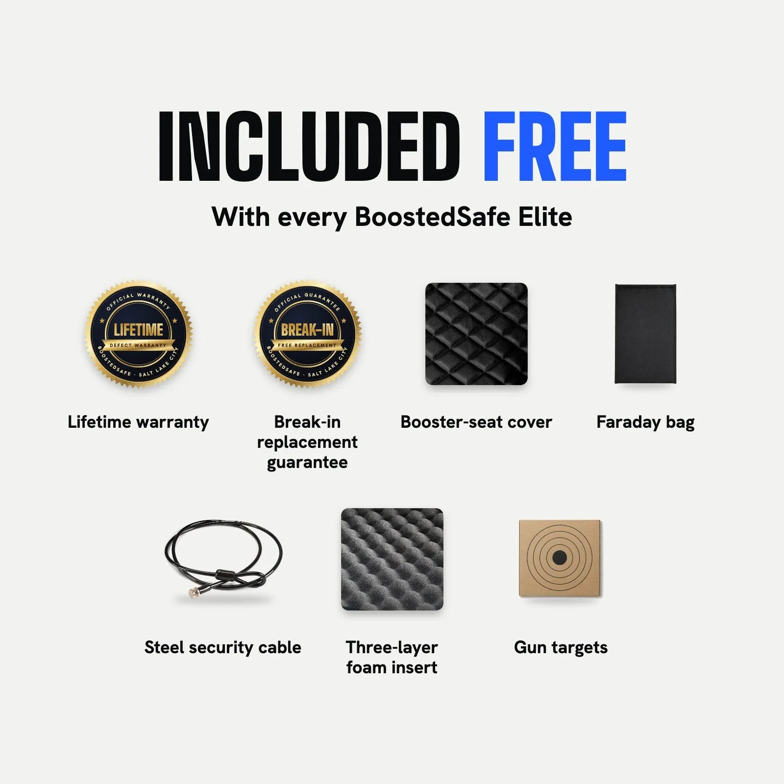
- "Included free with every safe," then three cards with switches and direct Add to cart, on 29 templates at once. Rebuilt October 31 from screenshots the ads lead sent.
- And the rest
- Hero video, credibility ticker, patent section, guarantee seals, founder block, sticky buy bar, glass header, footer aurora, predictive search.
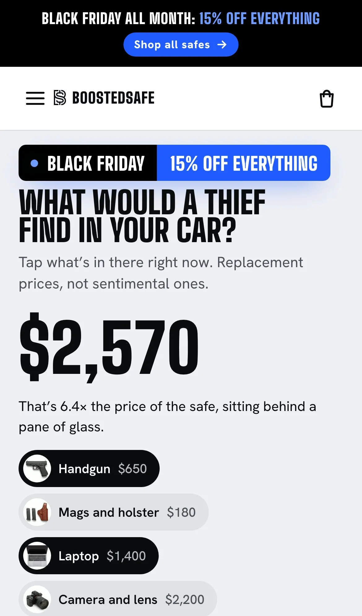
Two of the joke answers. People in the comments really did suggest a grenade. The nuclear option is public-domain footage of the Ivy Mike test.
Six safes run from one section, so a change to one is a change to all.
Every product page comes from one section and a seed script, so a change to one is a change to all. Six safes and a refurbished model, with the Elite pre-selected. The hard parts were pre-orders, financing and showing the free items without lying about any of them.
The renders and studio photos came from the client's creative team. I chose them, wrote the words, composed the 16:9 tiles as HTML, and rendered them with Playwright. So a copy change re-renders a whole gallery.
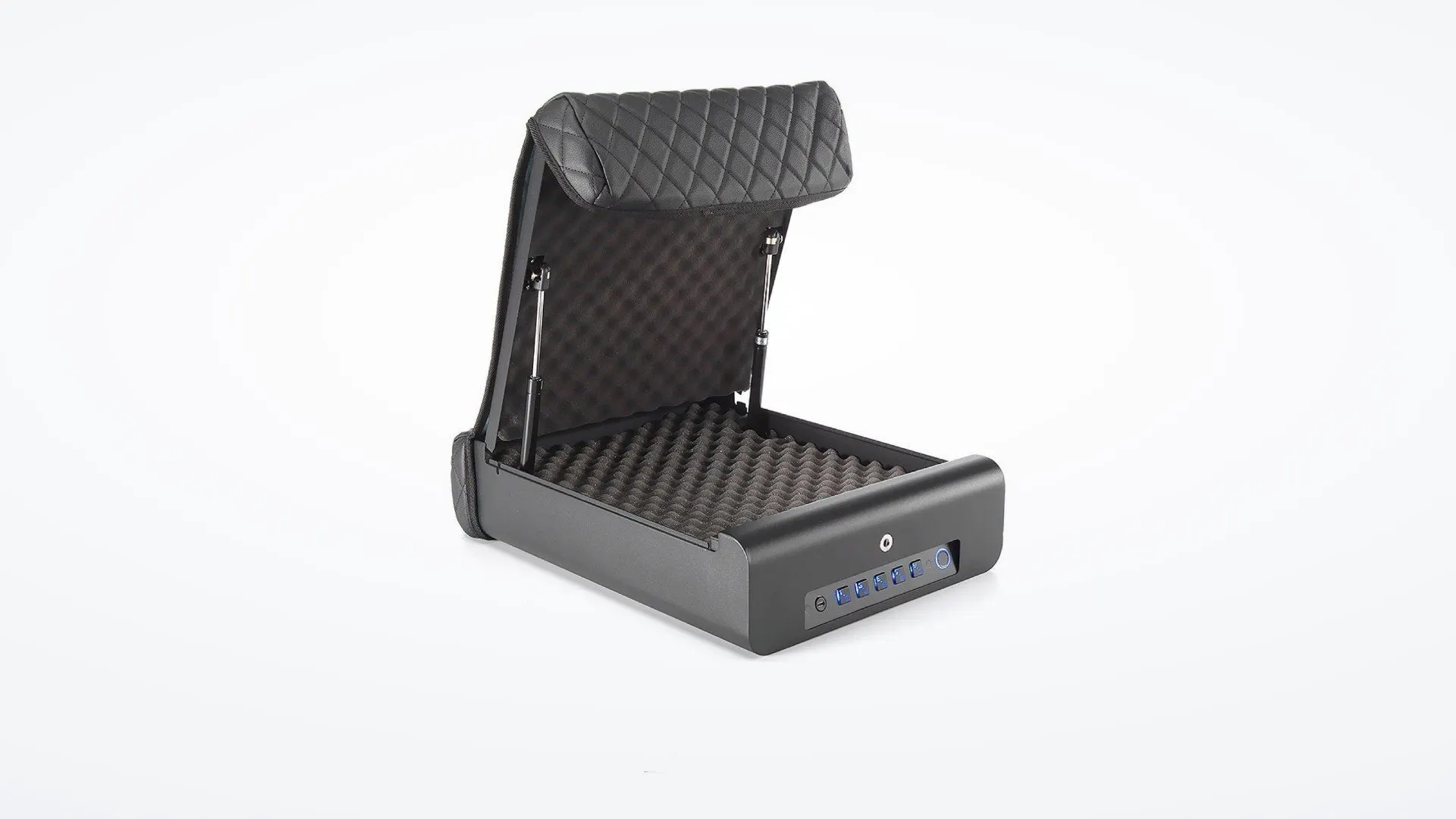
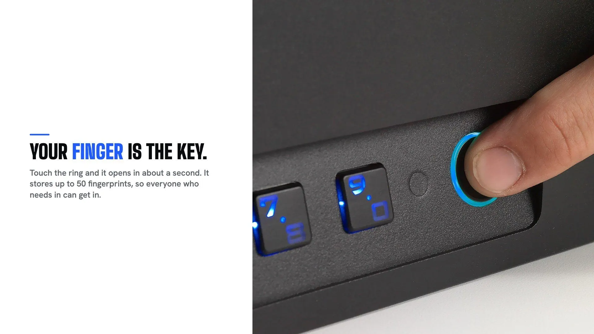
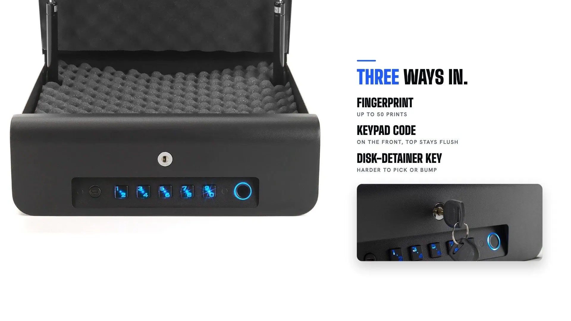
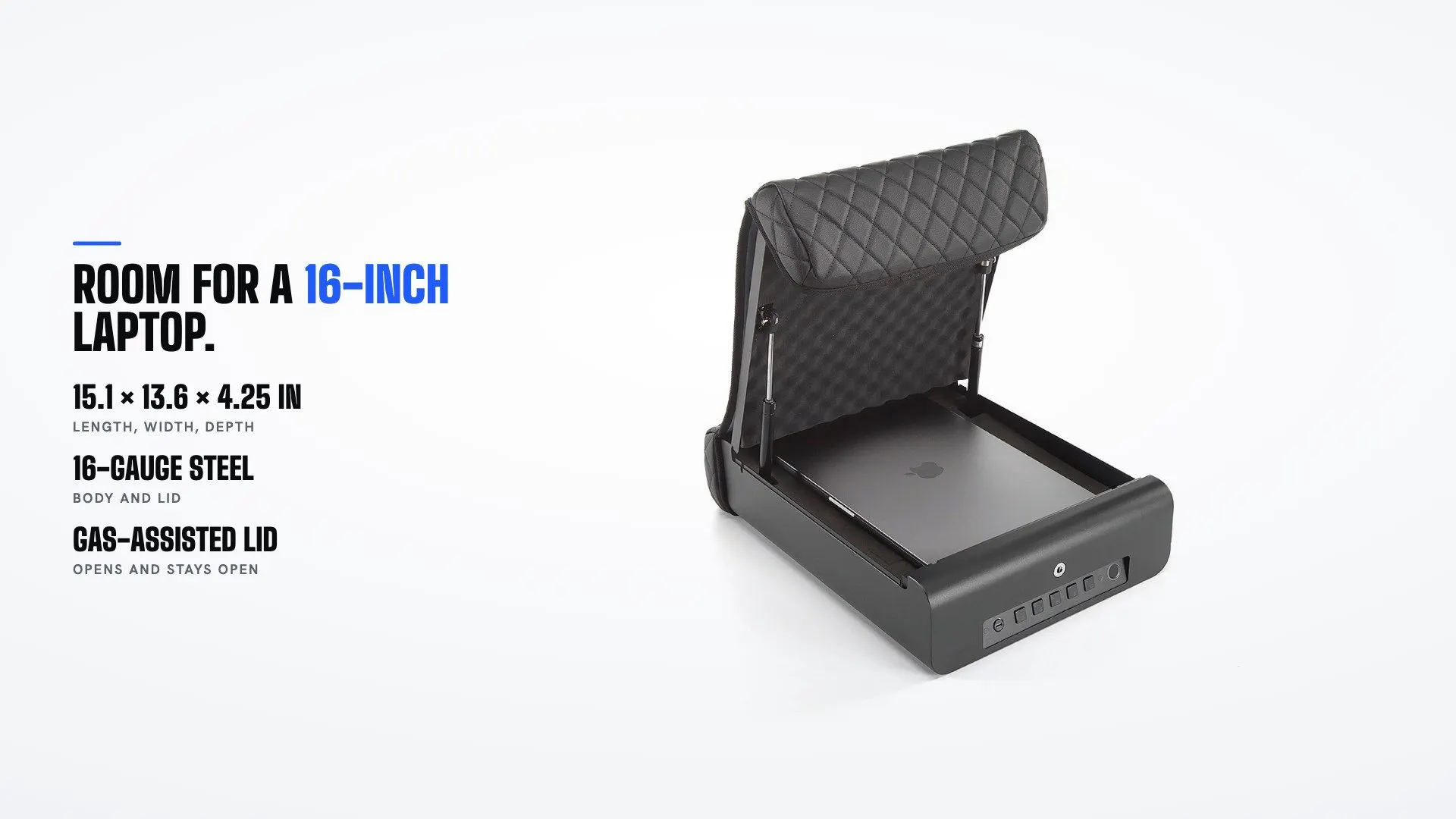
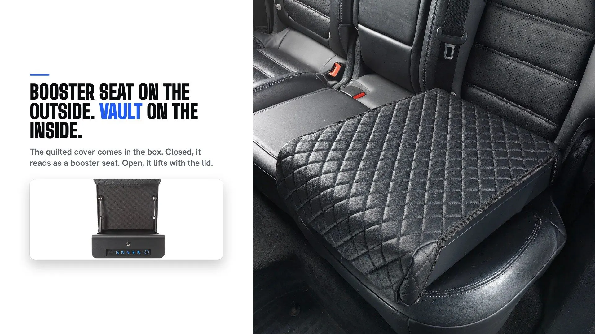
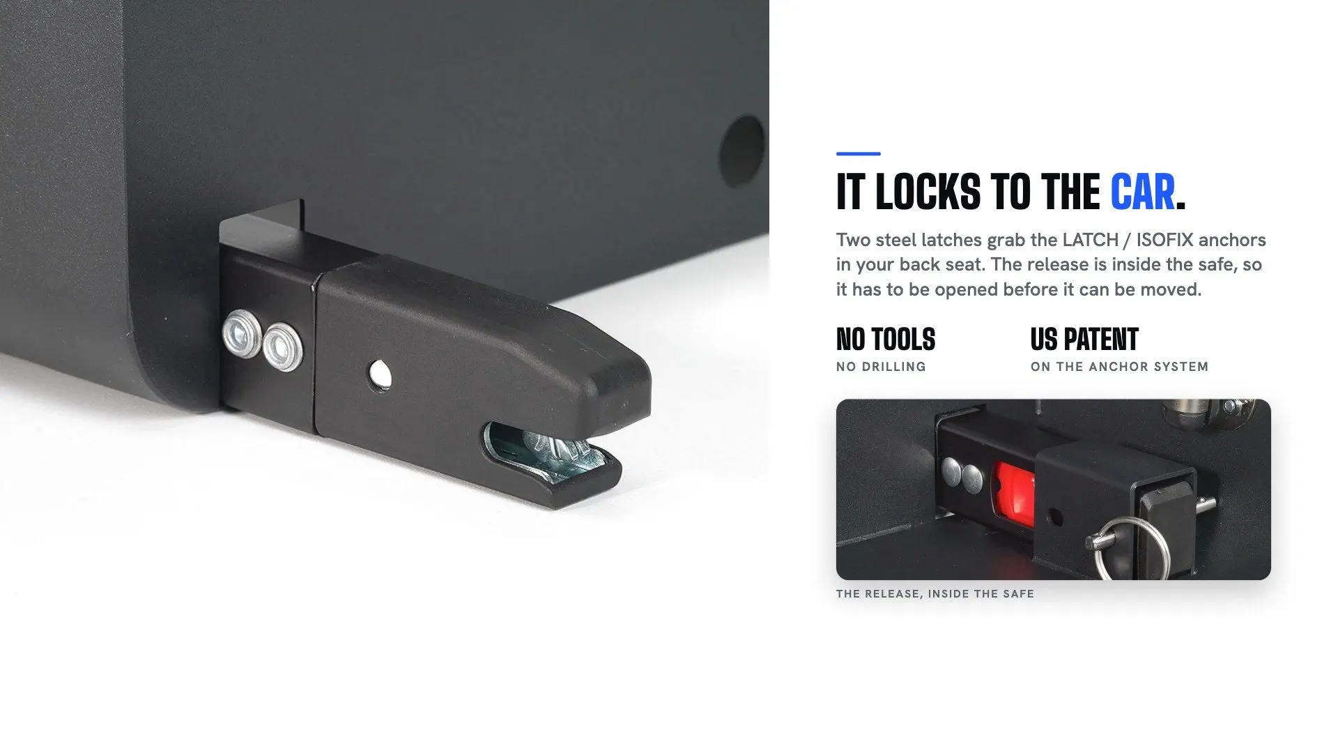
The Elite gallery. Each safe has 10 or more of these. Photos and renders by the client's creative team, tiles by me.
The spin on the Elite page, recorded on the live store. Scrolling turns the safe.
Three of the 8 product clips I cut from the team's footage: x-ray, features and the drag test.
- Quantity dropdown
- Each line shows the deal it unlocks. I rejected the first version, a stepper.
- Financing display
- Live Shop Pay terms from Shopify. No hand-typed amounts anywhere, and a test enforces that. The mock had the wrong amount, rate and brand, so the rewrite fixed the compliance too.
- Pre-order handling
- STOQ labels, ship months, buttons that follow stock, and an automatic switch to pre-order when stock runs out.
- "N sold" counts
- All purchases and pre-orders less returns, refreshed by script. One card said 12 pre-ordered when the real number was 161.
- Reviews
- Loox video slider and carousel placed above the spins, plus a fix for a cut-off bug using a ResizeObserver.
- 3D models
- GLB files in product media.
- Accessory galleries
- Cover, handle, strap, Faraday bag, foam and gift card.
- "Included free" in product media
- So the free items show up in the Shop app and on ad channels too, and product descriptions list them first.
- Finger, not thumb
- The reader works with any finger, and the copy said thumb. Gallery tiles re-rendered and 19 articles updated, with originals kept.
- Refurbished page
- Fully built, and at launch nothing linked to it. See the launch chapter.
The pages nobody puts in a portfolio answer the question that stops a sale.
A store is mostly these. They answer the question that stops a sale, and they're usually where a redesign runs out of patience.
- Shop page
- The whole card is clickable, with stock signals, and reviews or pre-order counts depending on state.
- Compare page
- Models against each other and against rivals, with a sticky switch to jump between.
- Reviews and Happy Customers
- Straight to reviews, with nothing in the way.
- Support set
- Fit page, FAQ, setup, manuals, warranty, shipping and returns, contact, support.
- Press page and press kit
- Linked cards, downloadable logos and photos, photo credit in the markup.
- Partner pages
- Referral, affiliate with dashboard links, dealer form, gift card page and art.
- Blog and article templates
- A long-read layout with a next-article block.
- Smash and Grab show page
- An autoplaying player for the client's web series: swipe between episodes, a next-job card, watched stamps, TV series markup and key art. The client's team made the episodes. The page, art and player are mine.
- Watch library
- 29 pages with the video first: 14 third-party videos with original write-ups, and 15 of the store's own with transcripts.
- Comment reply links
- Deep links that open a tool or a FAQ answer, so the team can answer an ad comment with a link.
- Terms of Service
- 14 sections rewritten, live October 31, fixing contradictions with the warranty and the certified Mini, with a rollback saved. A lawyer still needs to read it.

Key art I made for the show page. The episodes themselves came from the client's creative team.
Every buyer gets a page that starts with their problem.
A photographer and a parent want the same steel box for different reasons. So the landing pages open on the problem, then a calculator preset for that person. Ads could point at the right door.
California needed its own story. The Golden Gate Elite is on the state's Department of Justice list of certified firearm safety devices, so I built a section that shows the listing and links you to check it yourself.
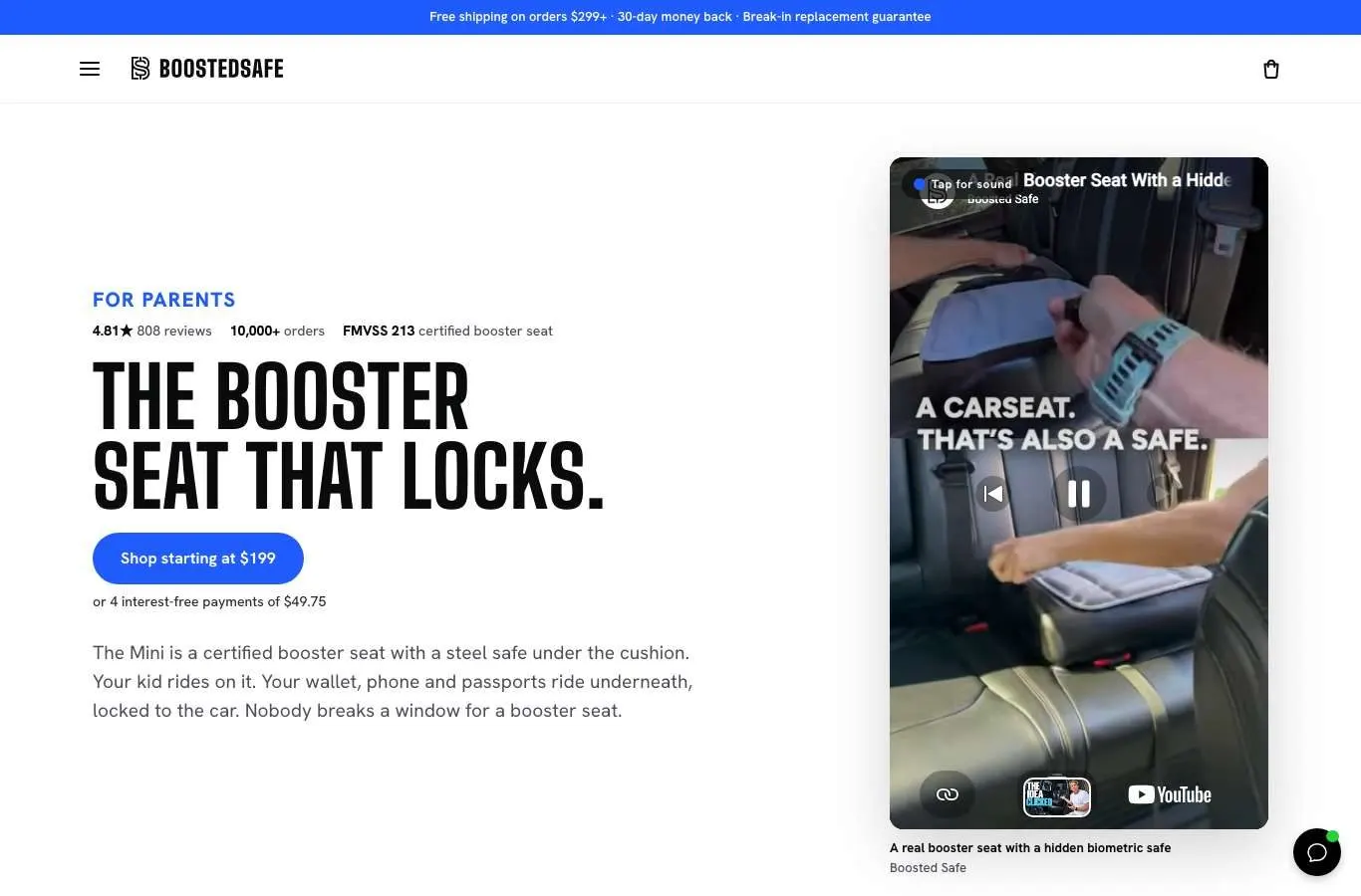
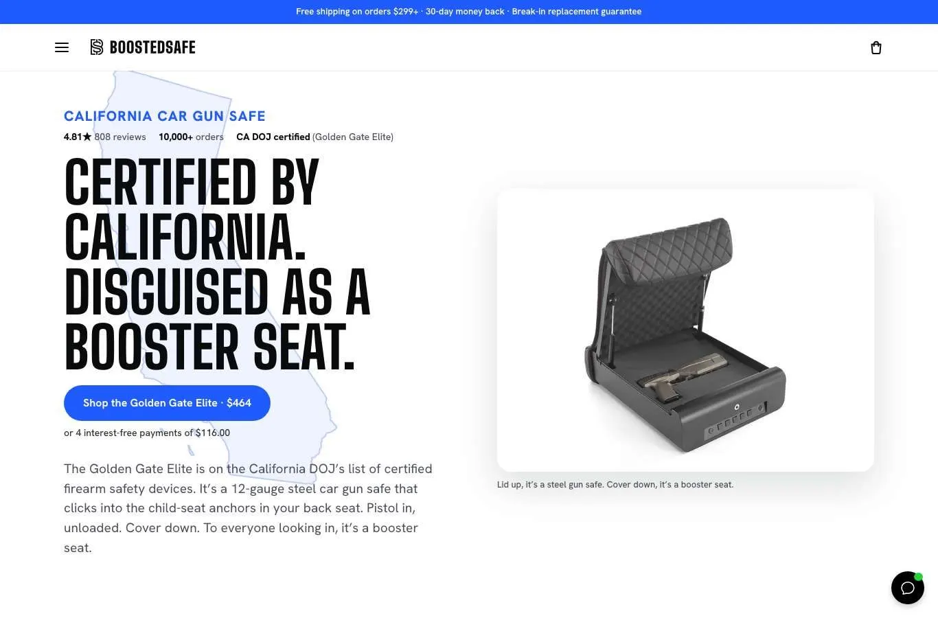
Photographers, parents and California. Each page opens on that buyer's problem.
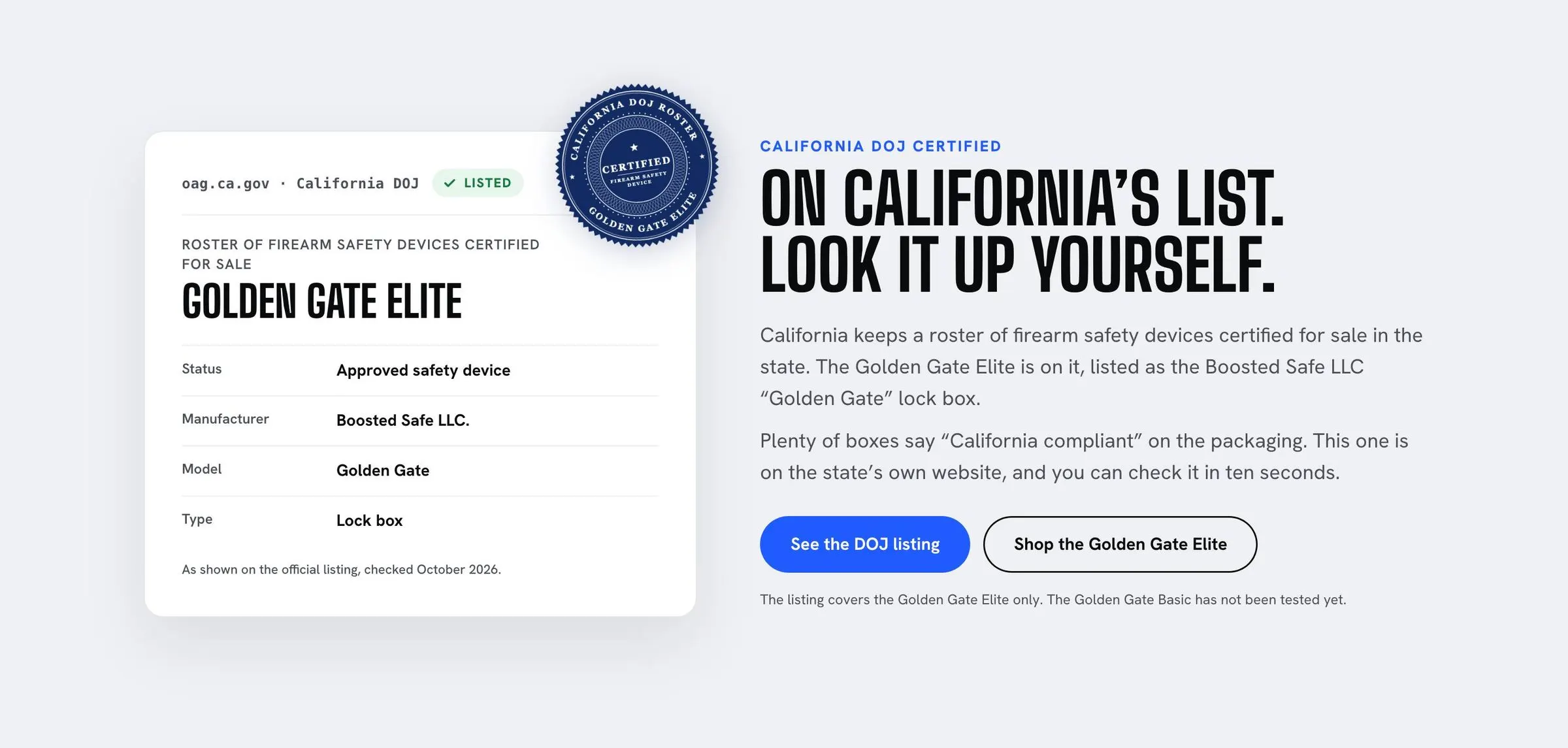
The Golden Gate Elite is on California's list of certified firearm safety devices. The section links you to check it yourself.
- Persona pages, round one
- Seven pages on September 29, with invented stories in them. I took those stories out before launch and retired the set.
- Persona pages, round two
- Parents, outdoor, hunters, first responders, rideshare, realtors, concealed carry, valuables, photographers, construction, law enforcement and travel. Problem first, each with its calculator.
- State pages
- California, Texas, Florida, Colorado, Connecticut, Delaware, Massachusetts, New York and Pennsylvania, plus a gun-law states hub.
- Three interactive ad pages
- Break-ins Near You, What's In Your Car, Pick Your Tool. The interactive part is the hero.
- First-time visitor header
- Logo and steps pill only, no menu, on landing pages. That was a team decision after a tied test, and I call it a decision, not a proven win.
- Page review pack
- Expert critique, before copies and screenshots for each page, plus search titles and 93 alt texts.
Free items that work on pre-orders, and a deal that replaced a joke.
Each safe comes with free items. Shopify's Cart Transform is the usual tool for that, and it fails on pre-orders, which is much of what this store sells. So I rejected it. Each free item is a real product, added automatically at $0 and matched to quantity, and a Flow closes the line at order. A warehouse note stops anyone picking extras. 16 cart checks cover it, and 202 of 209 site orders carried them.
Then there were the discounts. I found 8 old "joke" discounts still running, with names like "The Ocho." They stacked, they hit products that should never be discounted, and they broke referral codes.
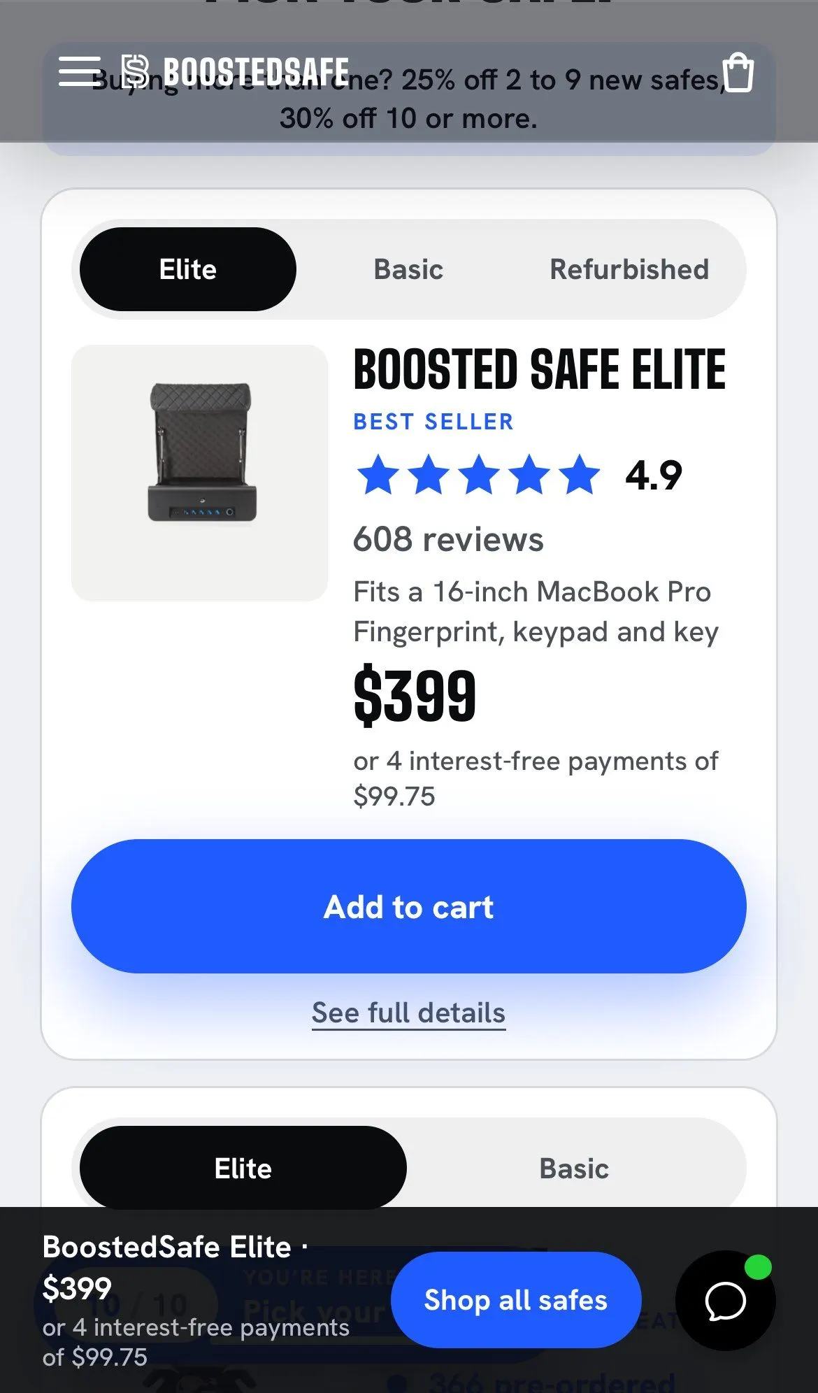
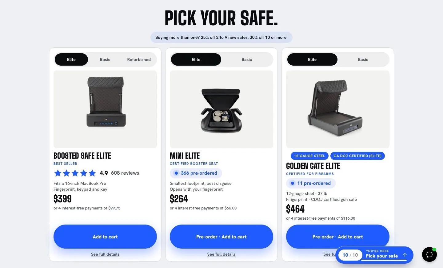
I replaced them with a clear multi-safe deal: 25% off at 2 to 9 safes, 30% at 10 or more. It shipped by script with a dry run, a go, and an undo. The script won't retire the old discounts unless real carts have priced exactly right in the last two hours.
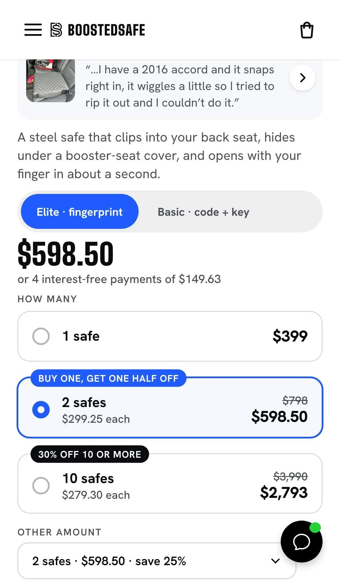
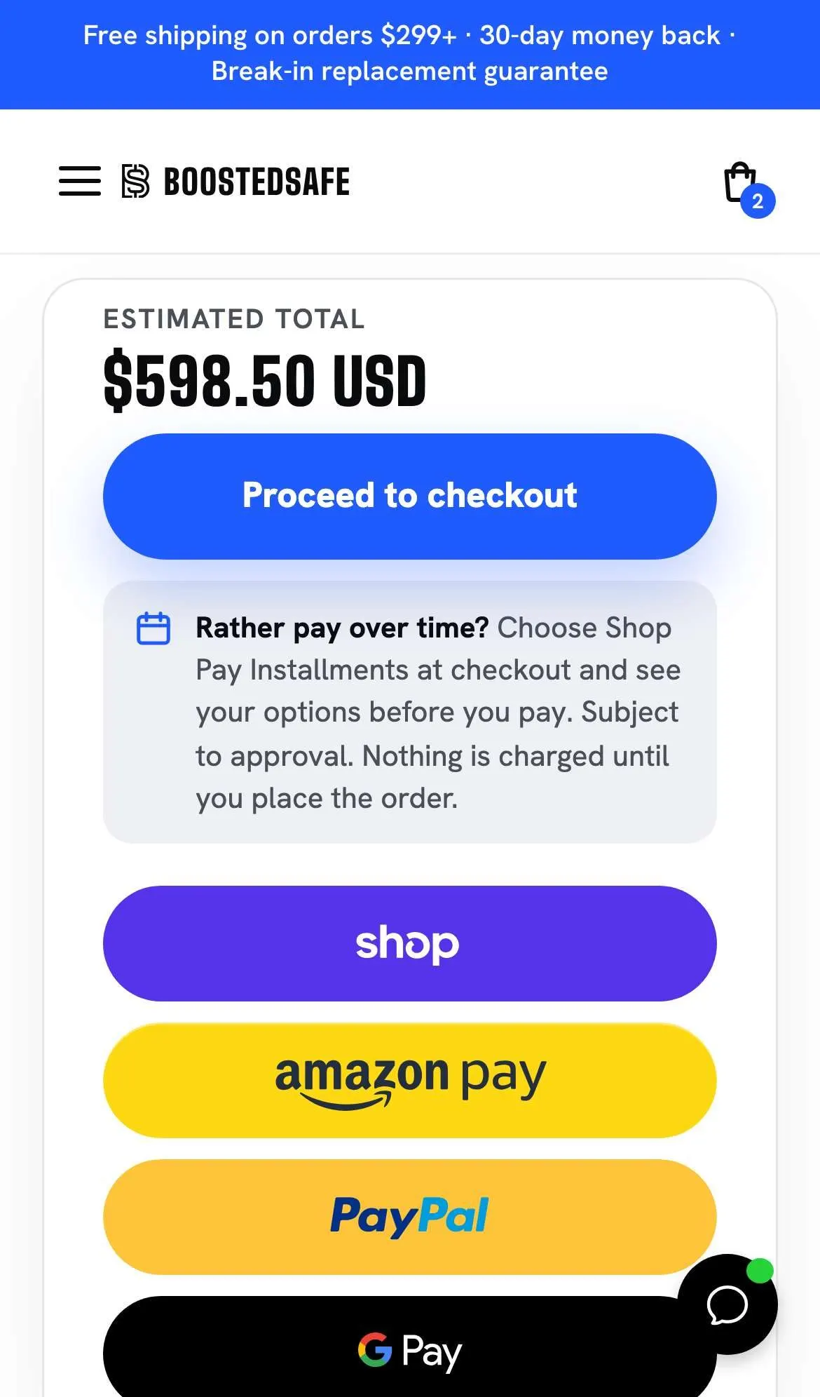
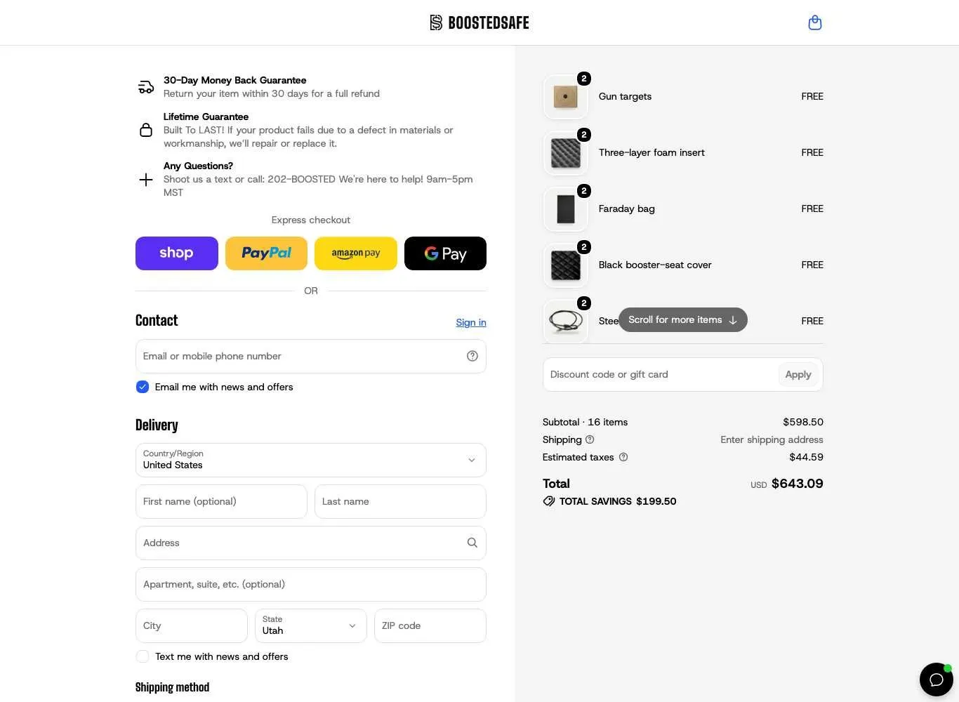
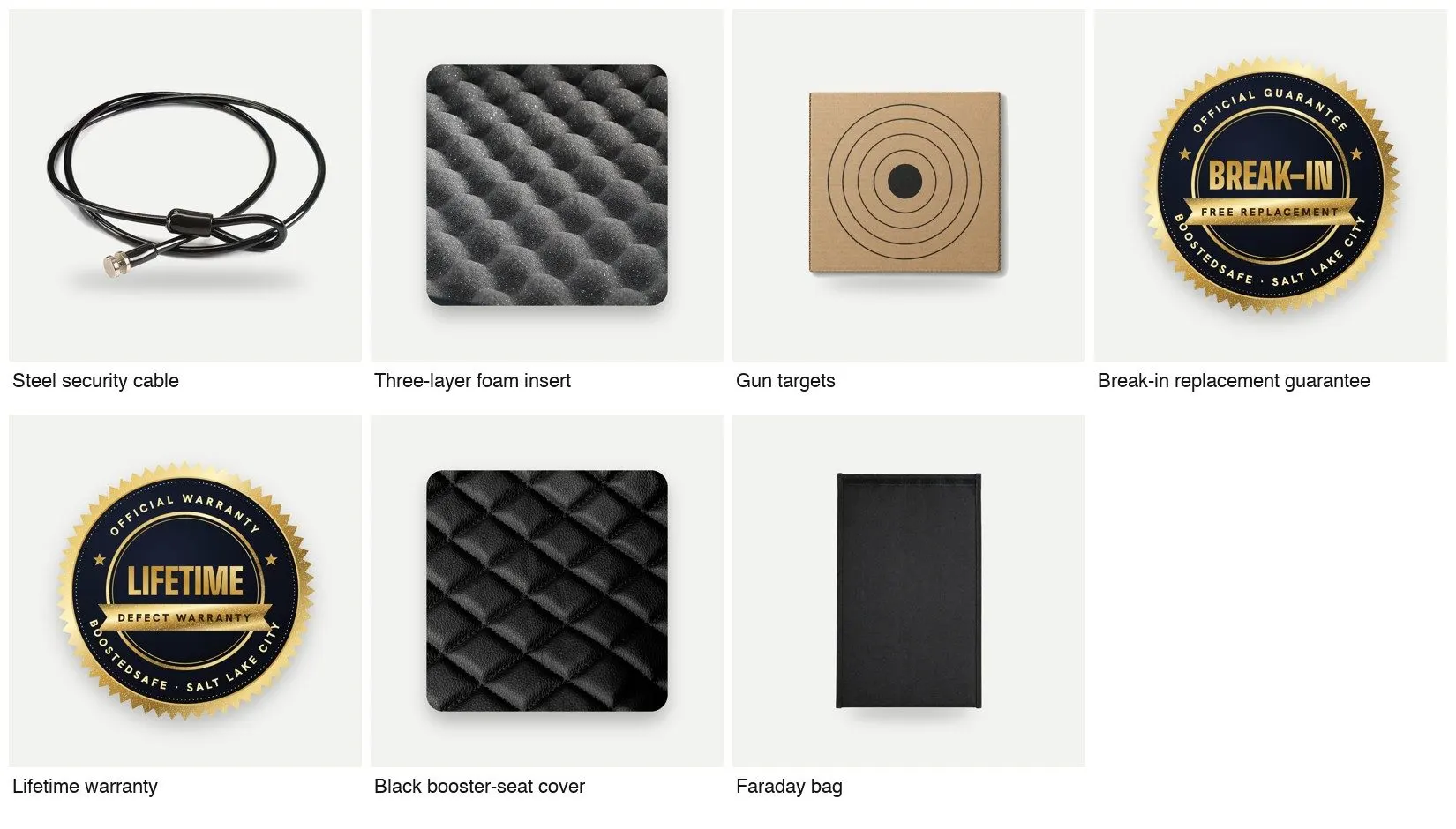
Free items show as their own $0 lines at checkout, so they work on pre-orders too. 202 of 209 site orders carried them.
- What the deal did
- Orders with 2 or more safes went from 3.0% over 4 weeks (15 of 501) to 12.7% at 2.7 days and 14.1% at 4 days (12 of 85). Multi-safe orders made up $6,109 of $31,188 in safe revenue over those days, or 20%. Small sample. I estimated about $2,100 in extra revenue in 4 days, or about $1,200 after taking out people who'd likely have bought anyway.
- Cart page
- One rating, blue checks, total biggest, checkout above the fold, and a free shipping progress bar.
- Checkout
- Logo, fonts, colors and Loox stars in Shopify's editor, plus Redo returns and store credit blocks.
- Bulk cart verifier
- A script that builds real carts and checks they price exactly as intended.
- Referral program
- BixGrow, $25 both ways, fraud rules, a 35-day hold, custom domain and a thank-you page widget.
- Waiting or unproven
- A box rules checkout function has code and tests, and I can't confirm it's deployed. A pre-order discount function is on hold. Shop app orders skip the $0 lines, and that's a sales call I left with the owner.
"Shop starting at $32,079.53." A currency bug, fixed the same night.
A screenshot came in through Messenger showing that on one of our pages. It was Jamaican dollars. Shopify Markets was converting prices for foreign visitors, and my big blue button was reading that out loud.
Before changing anything, I checked 90 days of orders. All 1,394 were US orders in US dollars. So I fixed it in Markets that same night. A small thing, and the sort of thing that only turns up when someone is watching the store.
I cut the home page from 60 MB to 14 MB.
The old home page was a 60 MB download. On a slow phone, in a lab test, it took 36.3 seconds to load. Files moved to Shopify's CDN, images went to WebP with space reserved, and videos got poster stills and lazy loading. Each measure below is the median of 3 Lighthouse runs on October 12, old live theme against new draft, unless it says otherwise.
The honest part: the lab performance score barely moved, 31 to 33. Blocking time comes from third-party apps, and those set the floor. I recommended cuts. Not all have happened.
Publishing would have silently killed email capture.
Five days before launch I had an agent compare the live theme and the draft, app by app. The live theme had 12 app embeds on. The draft had 2.
App embeds switch on per theme, so 10 of them would have gone dark the moment we published, with no error. The only email capture on the site was one of them, so email signups would have gone to zero. Affiliate tracking and the dealer form would have died the same way. The audit also turned up a dead speed app still in the code and an upsell script registered five times.
The audit gave every app a specific action to take before publishing.
- Migration plan and parity crawl
- Live against draft on 109 URLs, twice. All 109 returned 200, with H1s, FAQs and video markup all up.
- Launch Desk
- A living checklist of 176 numbered items, published for the team and kept current by script.
- Launch monitor
- Polled the pages and raised an alarm if checkouts started with no completions.
- Ad landing URL audit
- Traced traffic by page, and found two broken product addresses from ads.
Day one was the weakest of 8 days. Then we fixed 14 things.
The first 24 hours brought in $5,353 and 18 orders on 2,843 sessions, below all 7 days before it, which ran $5,803 to $13,724 and 20 to 32 orders. Add to cart was fine at 2.92%, the third best of the eight. The gap was at the end: 23% finished checkout against 26 to 42%.
I wrote that up the same night. The likeliest cause was a shift in ad mix: ad visits to one Mini page tripled while the main Elite ad page got half its usual visits. And part of it was mine. A whole product had no link. I also wrote, "One day of 18 orders is mostly noise," and that the first real read was a week away.
October 14, the first day after launch, hour by hour. 14 issues found and fixed the same day, including a refurbished safe that had no link anywhere.
We lost our own test, and I said so.
I tagged every cart, GA4 event and Clarity session with a site version and first-visit date, so any order could be split by test and by who it actually touched. Then we ran real A/B tests on live traffic through Shopify Rollouts, with about $3K a day of Meta spend behind it.
Test 1 was a long-form "infomercial" home page that the whole team believed in. The plan came from scoring the current home page by appeal: 18 sections of logic, 13 of credibility, only 4 of emotion, with about 20 shop buttons and prices not appearing until section 13 of 37.
It lost, 0.57% to 0.94%, 19 orders to 30, $7,242 to $11,336. I ended it early and wrote it up plainly. I'd also said too soon that it passed a 95% bar, and I withdrew that the next day. Shopify's own report said "not enough evidence." The useful bit: the long page got more shop taps even with the button hidden. So its parts moved onto the site one at a time, instead of all at once.
The clear winner that turned out to be a tie.
Test 2 hid the menu from first-time visitors. It read 1.6% against 0.87%, which looks great, on a day and a half of traffic. That's far too little, and I ended it to merge everything into one theme.
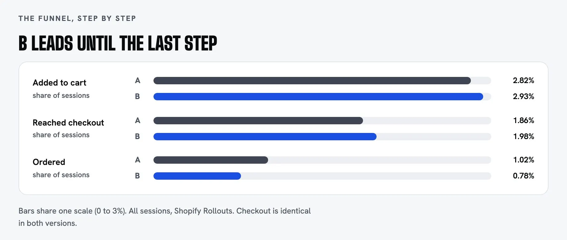
Test 3 asked the same question with one setting as the only difference. It ran three times, because Rollouts froze a copy of the control and my updates only reached B. Final read: A at 1.02%, B at 0.78%, 49 orders to 39, $17,434 to $15,490.
It looked like a win for A. An agent called it "the clear winner." But the menu only hides on a first visit, so anyone whose first visit came before the test saw the same site either way, and A had simply drawn more of those people by luck. A drew 18 orders from that group and B drew 11, a 7-order swing inside a 10-order gap. Take them out and it's 31 orders to 28, $11,133 to $10,917. B's buyers spent more, $390 an order against $359.
My verdict moved from "close to proven" to 1 in 18, to 1 in 5, to about 1 in 4, a tie. I reported each correction as it happened. The home page keeps its menu.
- How I run a test now
- Write the question and the metric first. Change one thing. Stop on evidence. Read by exposure, removing buyers who never saw the change. State the odds, especially when they're weak.
- Test readout page
- Funnel bars, a split by exposure, stated odds, and the decision options, shared with the team as a page.
- When not to test
- We agreed on no tests during Black Friday week. Sale traffic makes any read noisy.
The pop-up that said "It ends today." It didn't.
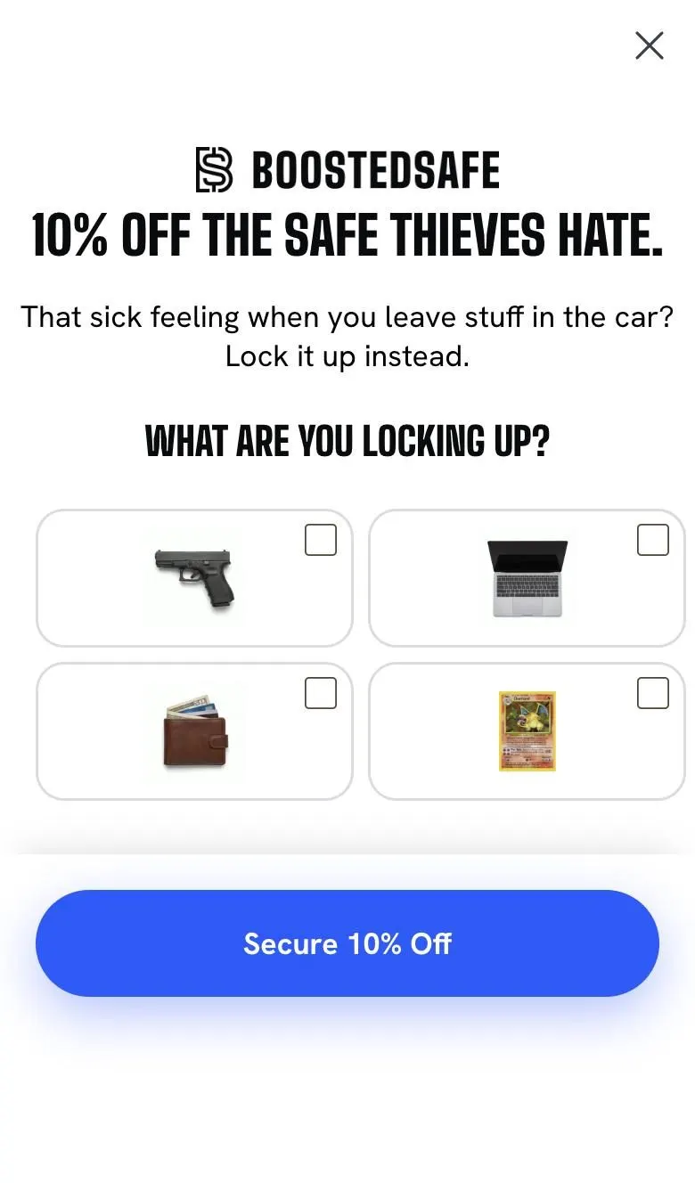
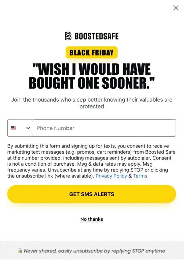
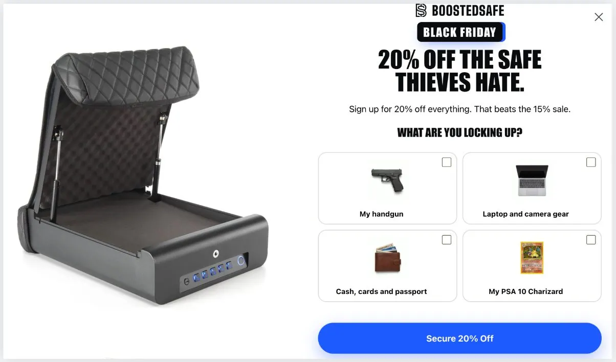
The old pop-up used false urgency. I replaced that line with "Lock it up instead." The new one is full screen with picture tiles for what you're protecting, including a handgun, a laptop, a wallet and a PSA 10 Charizard. The SMS step headline is a real review: "Wish I would have bought one sooner." It fits a phone without scrolling, with the button always in reach.
Email signups rose 56%, from 48 to 75 a day, and SMS 2.5x, from 15 to 37 a day, comparing the 3 days after it went up with the week before. Klaviyo-attributed revenue went from $1.4K to $3.3K a day, which is attribution only. That's a short read and not an A/B test. Site conversion held steady, so it didn't hurt.
Then I named the next leak. People who start now quit at the email step 61% of the time, up from 47%. And the SMS list grew by 89 against 112 phone-step completions. I can't explain that gap yet.
- Whose work this is
- The client's email agency runs the ongoing emails and texts. My work was forms, offers and connections.
- Custom CSS with a safe fallback
- Klaviyo doesn't support custom CSS, so it hangs on stable hooks. If they change their markup, the form falls back to plain Klaviyo styling instead of breaking.
- Targeting
- Hidden from existing profiles and on reading pages, where people came from search for an answer.
- Black Friday pop-up
- 20% on the Elite, on a schedule, with a side tab on desktop.
- Coupon and flows
- A single-use Klaviyo coupon for the Elite, a sale welcome flow and an existing-subscriber flow, with gating so the wrong people can't enter.
- SMS compliance
- Disclosure links, and a fix for a consent line that literally said "[company name]."
Search is growing, and we are not #1 yet.
That's the first line of the scorecard I wrote for the team. Category search is growing and nearly every page is indexed. Brand clicks and organic revenue fell. All of that is in the report, and all of it is here.
It's early. These are 18-day windows, most of the SEO pages went live October 24 or later, and ad spend moved across the period. The big head terms sit at the bottom of page 1: "car safes" at 9.8, "car gun safe" at 10.9, and "console safe" not ranking at all. That's the starting line.
- SEO and GEO playbook
- 13 sections with a keyword map, written before launch.
- Pass on live store data
- 127 product media alts, where there had been zero. 65 article image alts, 12 products, 23 pages and 24 article titles, with rollback snapshots.
- 287 internal links
- Across 70 articles, wrapping existing words only, and verified word for word so no sentence changed.
- 210-URL audit
- Titles, descriptions, leftover character-count notes in the fields, a misspelled link in 18 posts, all fixed with originals saved. Separately, two articles still had ChatGPT citation markers in them, and those came out on launch day.
- Structured data
- Product, FAQ, breadcrumbs, Organization, TV series, VideoObject, return and shipping policy.
- 16 articles
- 5 new, 8 finished drafts and 3 rewrites, all through the claims check, aimed with real volumes from 875 rows of Keyword Planner and Search Console data.
- 4 comparison pages
- Vaultek, Headrest Safe, Kwick Strike and Hornady RAPiD, with dated spec tables and a "where they're better" section. Admitting that is why anyone would believe the rest.
- Daily indexing queue
- A priority queue of sitemap URLs, driven through Search Console in the browser, about 10 a day. Bing Webmaster too, with 52 URLs accepted November 1.
- Fact pages and linkable data
- Car safe facts, a LATCH hub, and a break-in data CSV that others can cite.
- A robots file I left alone, on purpose
- Naming crawlers in it would have cost them the default rules. So the default stayed.
- Legal holds
- New York wording and an interstate article are held for a lawyer. I don't publish gun law on my own reading.
People ask ChatGPT what to buy now. So I measured that too.
I ran the same buyer questions through four AI engines. On questions that don't name a brand, Boosted Safe came up in 33 of 88 answers, and first in 17. Console Vault came up in 51 and Vaultek in 37. Gemini and Perplexity don't name the store at all on the 14 biggest terms, and Google AI Mode does on 12 of 14.
Read these as a best case, since they ran in my own signed-in browser. An earlier run used a different engine, so there's no fair trend yet. The first true comparison is December 1.
- GEO audit
- A 25-prompt panel across engines, with honest notes on the ones that blocked it. Bot walls got left alone.
- agents.md and llms.txt
- A plain factual file for AI assistants to read.
- Facts made consistent
- One rating, one "since," one order count across the site, the markup and the AI file, with evidence and before copies.
- Answer-first rewrites
- 6 questions now answered in the first sentence of the page.
- Monthly AI test
- 39 questions in 5 engines, logged and compared, on a schedule.
- Road to #1 plan and live scorecard
- A before and after page the team can read, with what's left and who owns it.
- Waiting on people
- Press and gift guide outreach, correction requests, an entity kit and email authentication steps are drafted for the owner to send. The biggest gap is off the site: the lists these engines read don't name the store.
Black Friday, built so Christmas is a settings change.
The sale runs all of November. I built it into the theme: name, percent, dates, color and countdown are all settings, with struck prices across every buy box and a preview by URL. Switching to Christmas means changing a few fields.
I tested the discount rules with real carts and temporary products: the biggest discount wins, and nothing stacks. The team got a run sheet of everything scheduled, with screenshots. It went live at 12:00 AM Eastern on November 1.
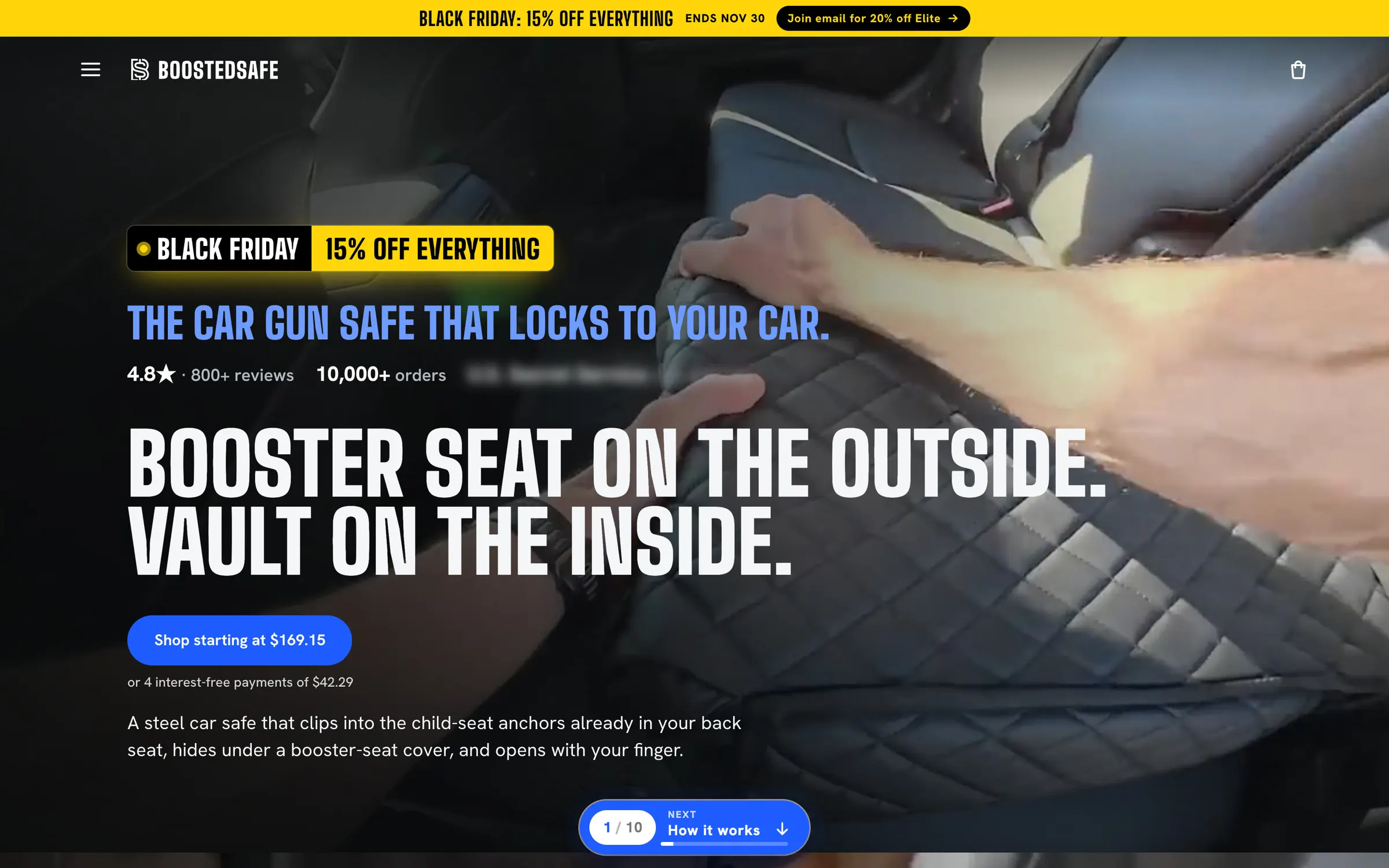
The home page on sale, captured November 2. A hero video from the client's team, under my layout, copy and steps pill. One line about a customer is blurred here.
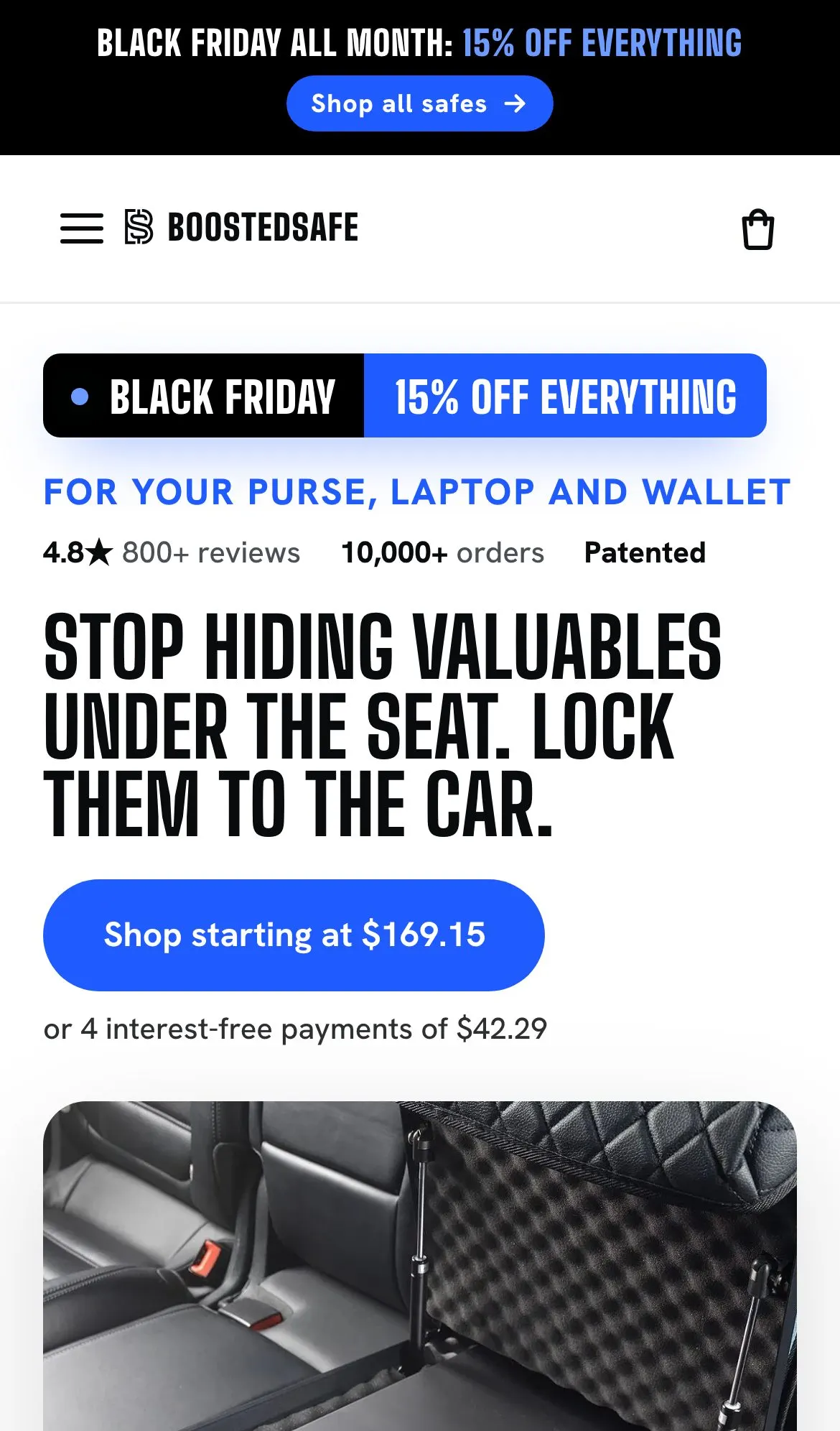
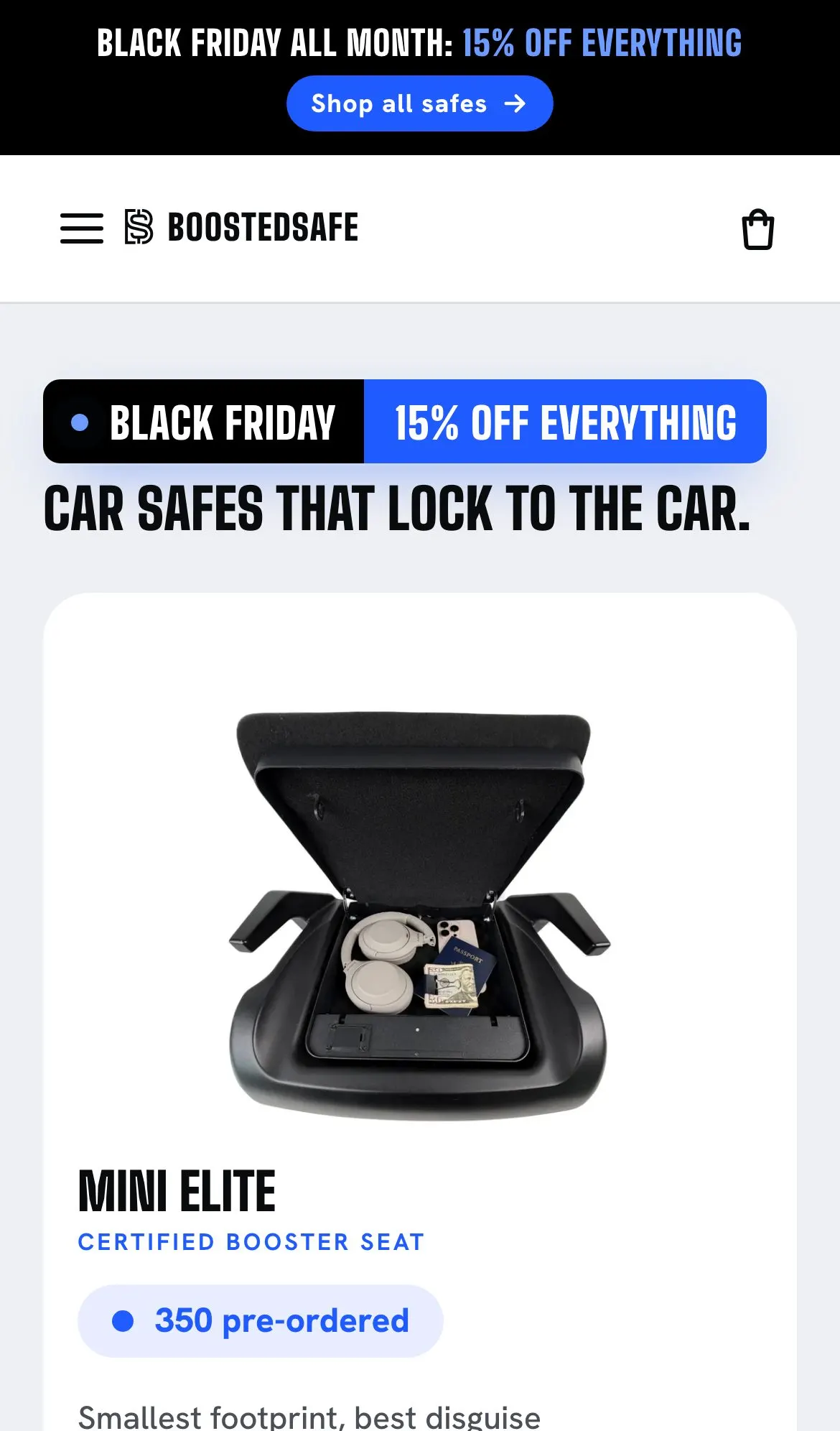
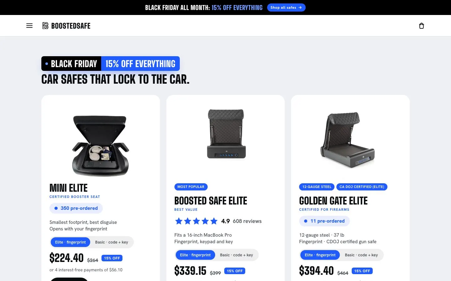
The shop page on sale. Name, percent, dates, color and countdown are all theme settings.
The worst bug came from Instagram's browser, and no test could catch it.
The owner found it, on a phone, by accident. Instagram's in-app browser autofilled the pop-up and dragged the whole page down to the footer. For a store where more than half the traffic comes from those apps, that's about as bad as a bug gets.
My tests had missed it for good reasons that were still my fault. They ran in Chromium and never in an in-app browser. They blocked Klaviyo so the pop-up wouldn't cover the page. They ran on a preview, never on the live site. And even my simulated autofill didn't move the page before the fix, so no script would have caught this one.
I fixed it that day. Email fields now stay switched off until they're near the screen, and the pop-up returns you to your spot when it closes. Then I wrote a plan for finding bugs nobody has imagined yet.
- Field watchdog
- A small script that sends signals to Clarity from real visits: page jumps with no touch, focus nobody tapped, blocked autofill, failed or stuck cart adds, scroll locks, and errors from our own files. Each one links to a session recording.
- QA plan
- Why the bug got through, field signals, an odd-one-out comparison by browser and device, and a real-phone walk through real ads for each release.
- First full QA sweep
- Every page across browser engines, including Apple's. It scored 91 of 100: no critical or high issues, 2 medium, 5 low, and those got fixed.
- Clarity setup
- Custom tags, a weekly prompt, a rebuilt funnel, saved segments, a watchlist, a GA4 link, and a daily read through the API with flags.
- Day one report and 60-day view
- A scoreboard with fixes and caveats, and charts with the phantom window left out.
- Reading a bad morning
- On October 31, conversion read 0.1% one morning. I traced it to a weak batch of Facebook traffic. It recovered by evening, and nothing was broken.
- Meta review
- Pixel domains and match quality checked, a score of 9.0. Ads themselves are run by an agency, so I don't claim their results here.
- Still to build
- A daily funnel alarm by source and device. The open question is who gets the alert.
The store gets checked every morning. Every change gets reviewed.
Every code change got an automated security review: 233 sessions, made up of 209 first reviews and 24 follow-ups. They flagged XSS paths, an unsafe way to push live, a discount scope error, and a discount retirement that reached too far. Some were false alarms. Several changed the code, including the push tool, the launch script and the indexing queue.
A scheduled agent also runs a daily check with a report on file for every day since October 22.
- What the daily check covers
- Runtime versions, packages against OSV, GitHub, storefront scripts, theme drift against the repo, a real checkout click on phone and desktop, and a sweep of the news for advisories.
- What it caught
- A dead tracking pixel domain that someone else could have registered and used to serve code, and an exposure notice about an app the store uses.
- Scripts on a schedule
- Daily SEO log, indexing queue, Clarity read, plus one-time reminders so the sale switches over on the right night.
The ads sell the interactive pages by showing them working.
The agency runs the ads. On October 23 I made three vertical motion ads in Remotion, written in code and rendered from it, each one selling an interactive page by showing it working. They use the store's own numbers and jokes.
The creative lead and the client's team supplied the studio photos, renders and footage, and they made the show. My part was selecting, cutting, compositing and building.
Three motion ads, written in code with Remotion. Each one sells an interactive page by showing it working.
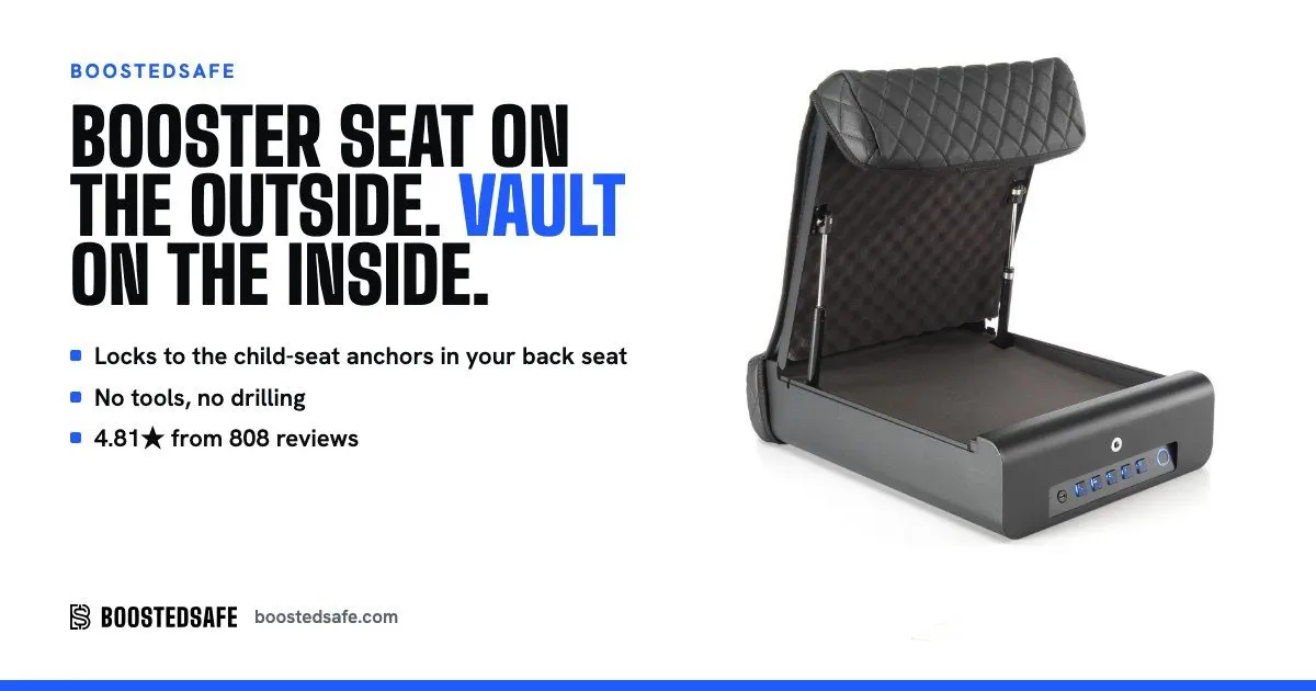
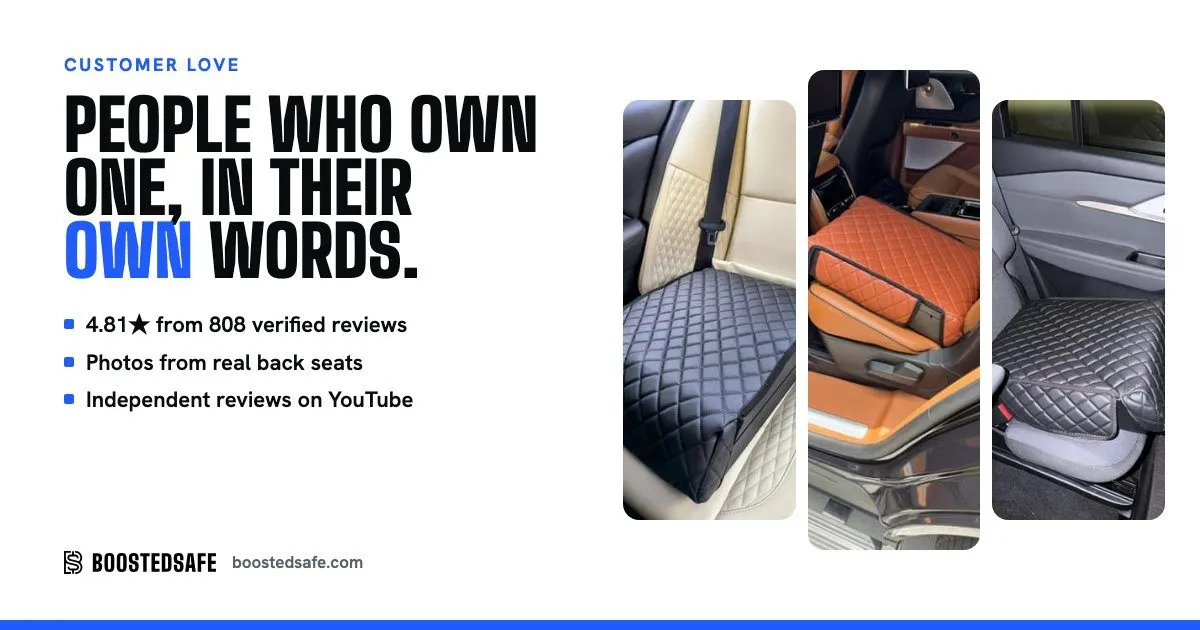
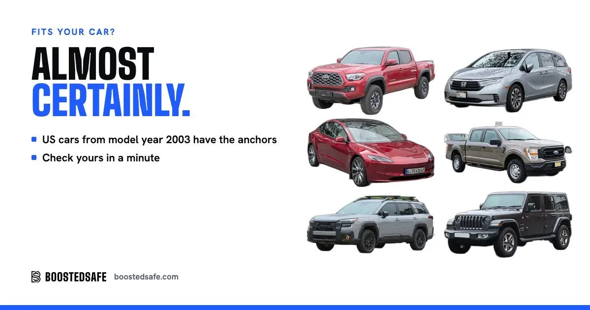
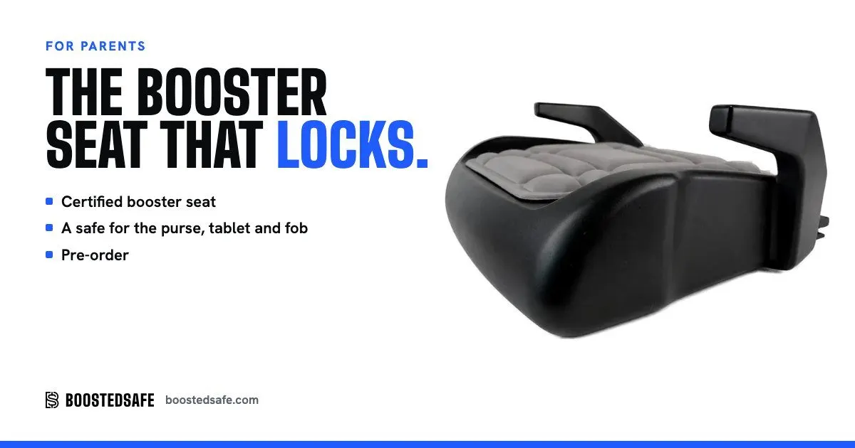
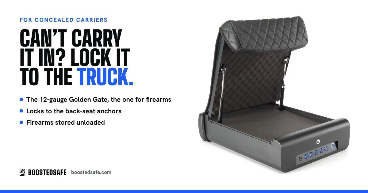
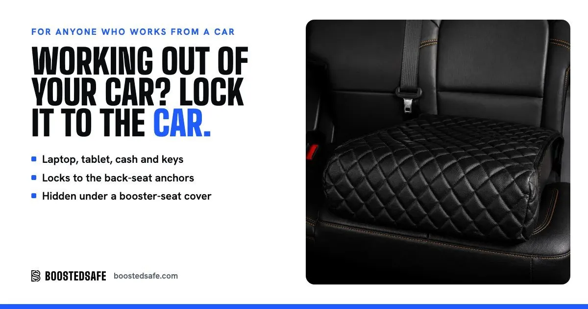
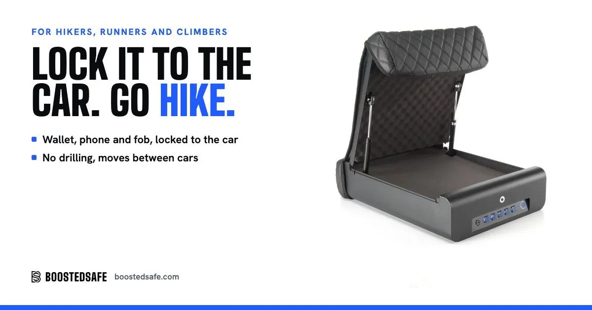
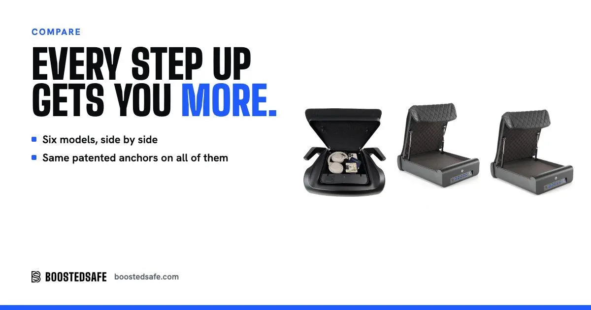
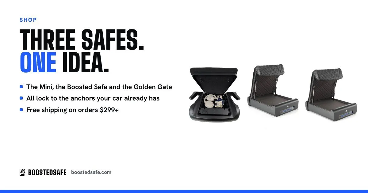
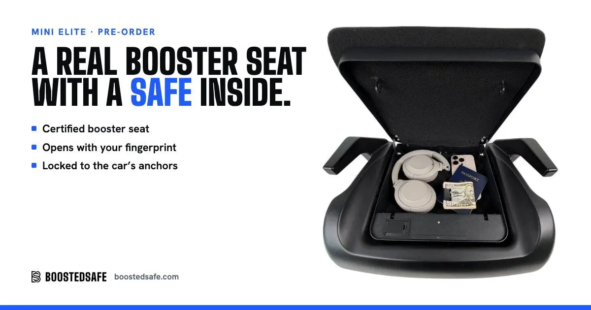
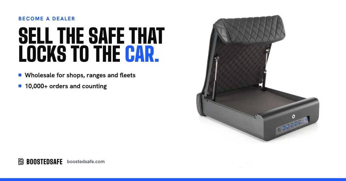
12 of the 23 share cards I made, so every important page looks right when someone sends it to a friend.
- Video edits
- A setup video, loops and an in-car install clip, cut from the client's shoots with ffmpeg.
- Tool attack videos
- Grenade, nuke, bolt cutters and more, cut for the picker.
- 92 videos transcribed locally
- The raw material for the Watch library and the claims gate.
- AI images, with limits
- Generated stat scenes and calculator items are allowed for now. Generated faces are never allowed on real reviews. AI product details got rejected when they invented where parts go.
- Cut-outs
- rembg over Commons photos and studio shots, for the vehicle wall and product cards.
- Press photo set
- Downloadable images for the press kit, with credit in the markup.
Agents let one person cover what used to take a team. This is what they ran on.
Every tool I touched for this job, and what I used it for. Agencies and the client's team run some others, and those aren't on the list.
- Claude CodeMain builder, on Opus, Sonnet and Fable, with parallel agents
- Claude in ChromeSigned-in dashboards, in my own browser
- Claude artifactsShared reports for the team
- gstack skillsPlan reviews, investigation, QA
- ImpeccableDesign and contrast checks
- Shopify PlusStore, Markets, Rollouts, Flow, Files, checkout editor, Search and Discovery
- Dawn 16, Liquid, JSON templatesTheme base and the custom layer
- Shopify CLI, Theme CheckPushes and validation
- Admin GraphQL, ShopifyQLStore data, reports, discounts, media
- Shopify FunctionsBox rules code, not confirmed deployed
- STOQPre-orders and ship months
- LooxReviews, kept as the only source
- BixGrowAffiliates and referrals
- RedoReturns and store credit blocks
- KlaviyoForms, flows, coupons
- GA4, Tag ManagerAnalytics and custom dimensions
- Search Console, Keyword PlannerSearch data and indexing
- Bing WebmasterIndex and Copilot citations
- Microsoft ClarityReplays, funnels, field signals, API export
- Meta Ads ManagerRead only
- D3, TopoJSONBoth maps
- WebGLSmoke fluid simulation
- RemotionMotion graphics ads, in code
- ffmpeg, PIL, sips, rembgVideo and image work
- PlaywrightTests, and rendering the galleries
- Lighthouse, axeSpeed and accessibility
- GitHub ActionsCI with pinned actions
- VercelClient review sites, brand bible
- HiggsfieldStand-in images, under limits
- Local speech-to-text92 video transcripts
- GranolaCall notes
- Python, NodeEvery script on this page
What went wrong, and what's still open
- The store-wide number has sat below what I launched while tests ran, and that's the price of testing on live traffic.
- I missed the first launch date by 18 days.
- Day one was the weakest of 8 days, at $5,353, and part of that was mine: a product with no link and a code missing from the bar.
- Test 1 lost. Test 2 was too small. Test 3 tied, and it took three runs because a frozen control caught me out.
- I said a test had passed the 95% bar, then took it back. An agent called a tie a clear winner. Each got corrected in writing.
- Brand clicks fell 25% and GA4 organic revenue fell 14%, and Console Vault leads the AI answers. I don't yet know how much of the brand drop is competitor ads.
- The lab performance score barely moved, because third-party apps still set the floor.
- On September 24, a comma-separated file list pushed nothing, and three pushes reported clean. The tool now rejects commas, and files get pulled back and compared.
- Merge conflict markers reached the draft and broke the CSS. The staging tool refused every push after launch, because it still pointed at the theme that had gone live. Both are fixed, with rules written.
- The Instagram bug reached real customers, and the owner found it, not me or my tests.
- A yellow sale tab covered Add to cart on phones, and my first fix broke the sale bar button.
- An agent also said a pre-order had no limit when it did, and misread my own notes more than once. That's why nothing it says goes out unchecked.
- Invented persona stories, stand-in faces and an AI founder photo all got built before the rule stopped them.
- Google Ads still shows as not connected in Clarity. A lawyer still needs to read the Terms. The funnel alarm isn't built.
Selling something online? I do this.
The strategy, the store, the tests, and the agents that keep watching it after I log off. You'll also hear what lost.
Start a conversation