
I grew Instawork's design team from 2 designers to 13, and built research from zero.
From 2021 to 2023, I took Instawork from two designers and no researcher to 13 designers and 2 researchers, across continents. Along the way we started a research practice, ran a survey of pros that drew 10,000 responses, built a design system with engineering and set a bar for what counted as shipped. Here's how I built it, and the decisions that made it work.
What happened.
Design went from two people to 13 designers and 2 researchers. We hired the company's first UX researcher, which started a new department, and our first big survey of pros drew 10,000 responses. Our Figma community file went past 300 duplications.
I'm careful with team numbers, because a team's work belongs to the team. These are the ones I'll stand behind.
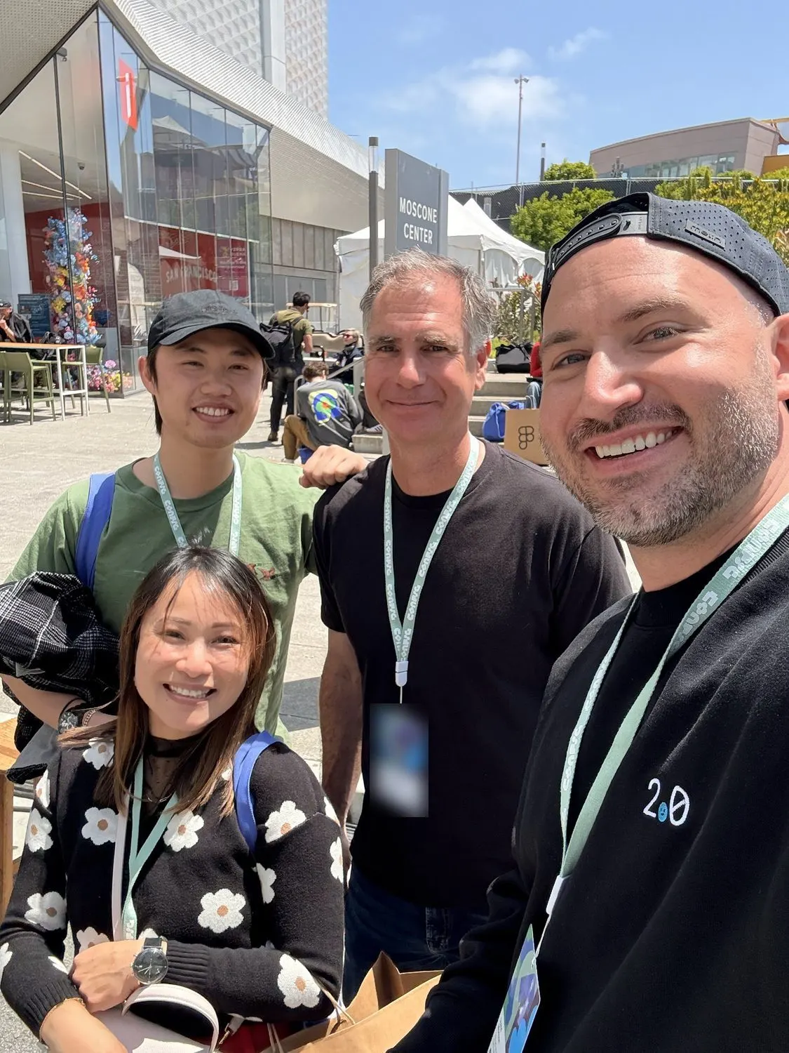
Instawork designers at Config. When we began scaling, design was two people.
Two designers can't cover a two-sided marketplace. So I wrote a one-page plan.
The company was growing fast. Pros on one side, businesses on the other, phones and web on both. Design had become a bottleneck.
I wrote a one-page masterplan for what I was building. It had seven lines.
- Drive great product design
- How we find problems, and how we solve them.
- Design efficiently and consistently
- The design system, and how we talk to each other.
- Push the brand and visual design forward
- Illustration, motion, sound and haptics, celebrations and achievements.
- Support every pod well
- High quality design across all product teams and the wider company.
- Plan the future information architecture
- Where the whole app was heading.
- Do valuable research on both sides
- Pros and partners alike.
- Build a public design team brand
- So good people would want to join us.
I hired for how people think when the first answer is wrong.
Hiring was the first real job, and I designed the process around one thing in particular.
Our guide for candidates said so in capital letters: "SHOW ITERATIONS." The first solution is never the best one. I wanted to see the failed versions of an important screen and how someone got from there to the final result. I also asked for clear descriptions of what was their own work and what was done by others.
To recruit, I outlined a deck around what a good designer would want to know: the investors, the growth, the tools we used, photos of the team, and our work-a-shift program.
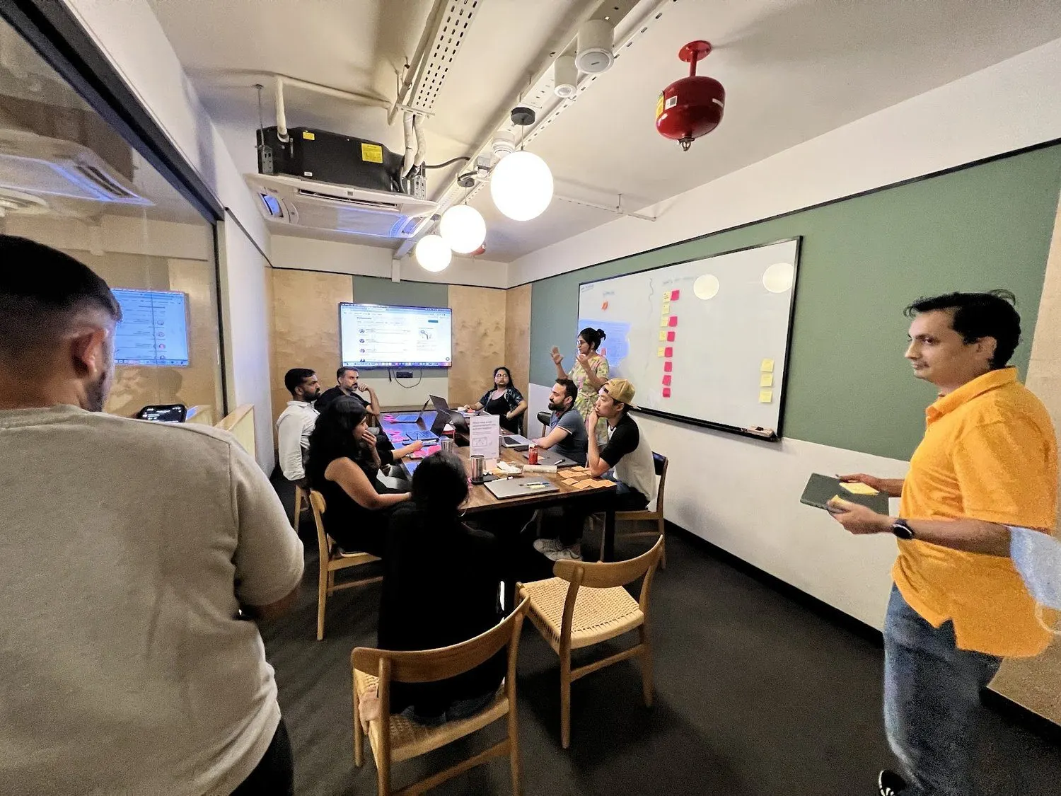
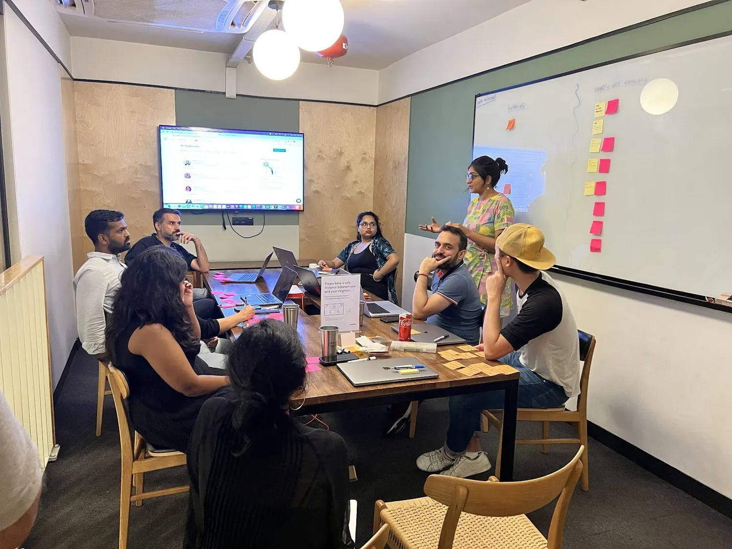
A team session in July 2022.
We hired our first researcher, then made research everyone's job.
Instawork had no UX researcher when we started. The job post for the first one asked for the usual skills, plus the line that mattered most to me: "A willingness to book shifts on our platform and conduct research as an actual user of the platform."
In a talk to the company, I said we are all researchers, and asked who had worked a shift or visited a partner and learned something new. Our goal was a shift or partner visit every month. Designers did them. I did them too, and that's its own story.
The trouble with lots of research is losing it. Great notes from partner visits were getting read by a handful of people and then disappearing into a busy Slack channel. So we chose tools to keep what we learned.


I worked shifts too: beside a forklift, and back of house at a stadium. We are all researchers.
- First segmentation
- With our researcher, sorted pros into groups by behavior and more, and brought it to product review. It helped design and helped marketing and sales speak to pros better.
- State of the Union survey
- Our first big survey of pros, with 10,000 responses.
- Dovetail
- A research repository, for tagging, transcribing, clipping and publishing what we learned.
- Maze
- Prototype tests, early enough to fail cheaply. We looked at the market leader, but it was among the most expensive tools we'd seen. A cheaper option had an experience so poor we worried it would skew the results. Maze had just improved enough to do the job.
- Sprig
- Surveys inside the app, asked right as someone uses a feature, plus usability and satisfaction scores over time.
- Fullstory Friday
- The company watching real sessions together. It built urgency and empathy, and I wanted it deeper in how we designed.
- Quick work when it counted
- When a recession looked likely in 2022, our researcher and I ran a fast survey asking partners how they expected to change their staffing.
400% ownership: if something gets missed anywhere, it's everyone's fault.
A team that doubles keeps breaking things it used to do by instinct. So I wrote down how we worked and fixed the parts that hurt.
The rule I cared about most was one I called 400% ownership. Product, design, engineering and QA each own 100% of what reaches users. Users don't care about our schedule.
Or as I put it in our strategy document: the standard is whatever is tolerated.
- Crit, revamped
- A new format for design critique, on both sides of the world.
- Weekly product review format
- A standard design format for the company's main product forum. We rehearsed it together, so every designer could lead one.
- Design QA
- Clear expectations and process with engineering and QA, to cut the issues reaching production. By Q1 2023, the goal was every pod trained and using it.
- Shared standards
- A push to agree margins, gutters, padding and breakpoints between design and engineering. New standards for file organization and spec files too.
- Rapid onboarding
- A faster way to bring new designers up to speed.
- Growth
- A career ladder, a self-assessment across the skills a product designer needs, and support for courses.
- Behavior as a craft
- We read and presented on books like Thinking, Fast and Slow, Hooked, Nudge and Atomic Habits, because good nudges are a skill you can learn.
- Team on-sites
- WPR practice, North Star debates, design principles, a team dinner. Plus a session to write and ship something public right there in the room.
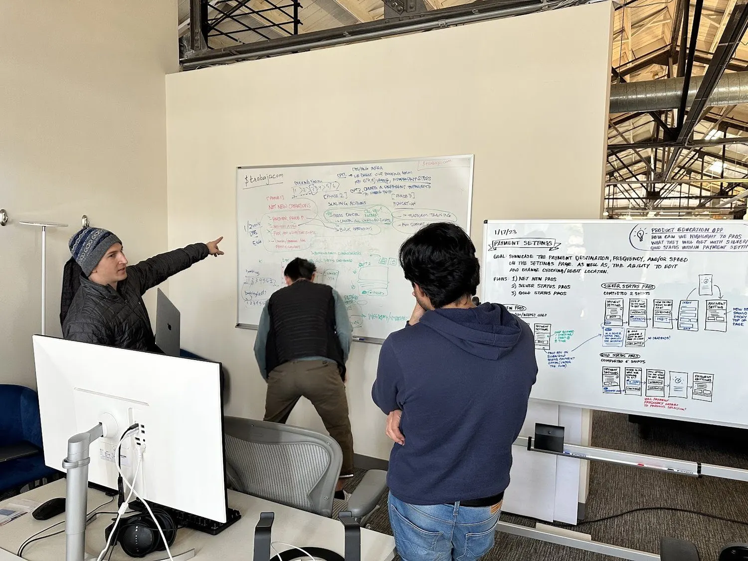
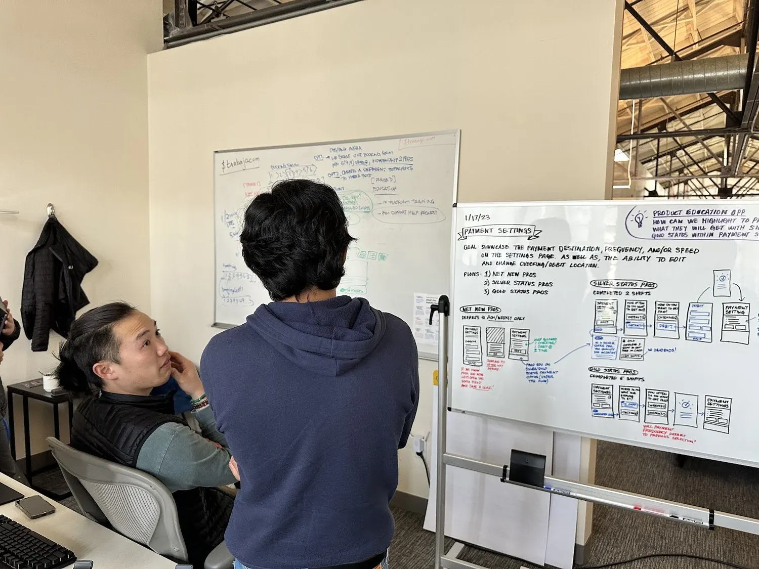
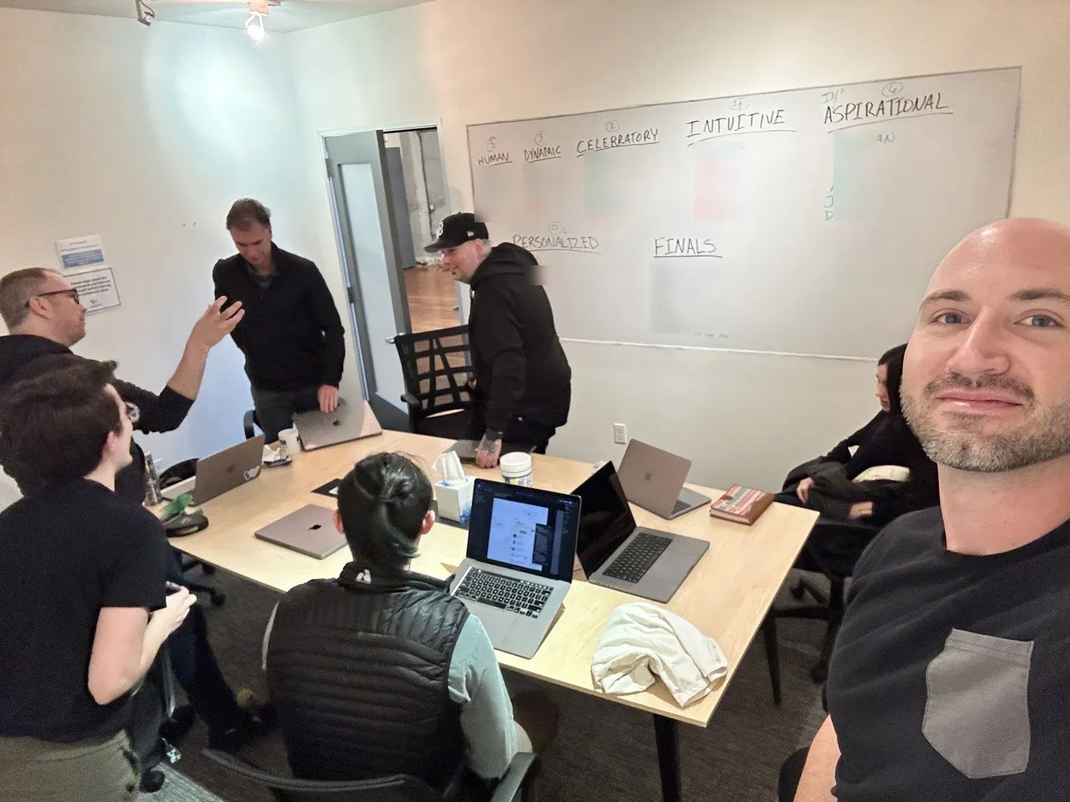
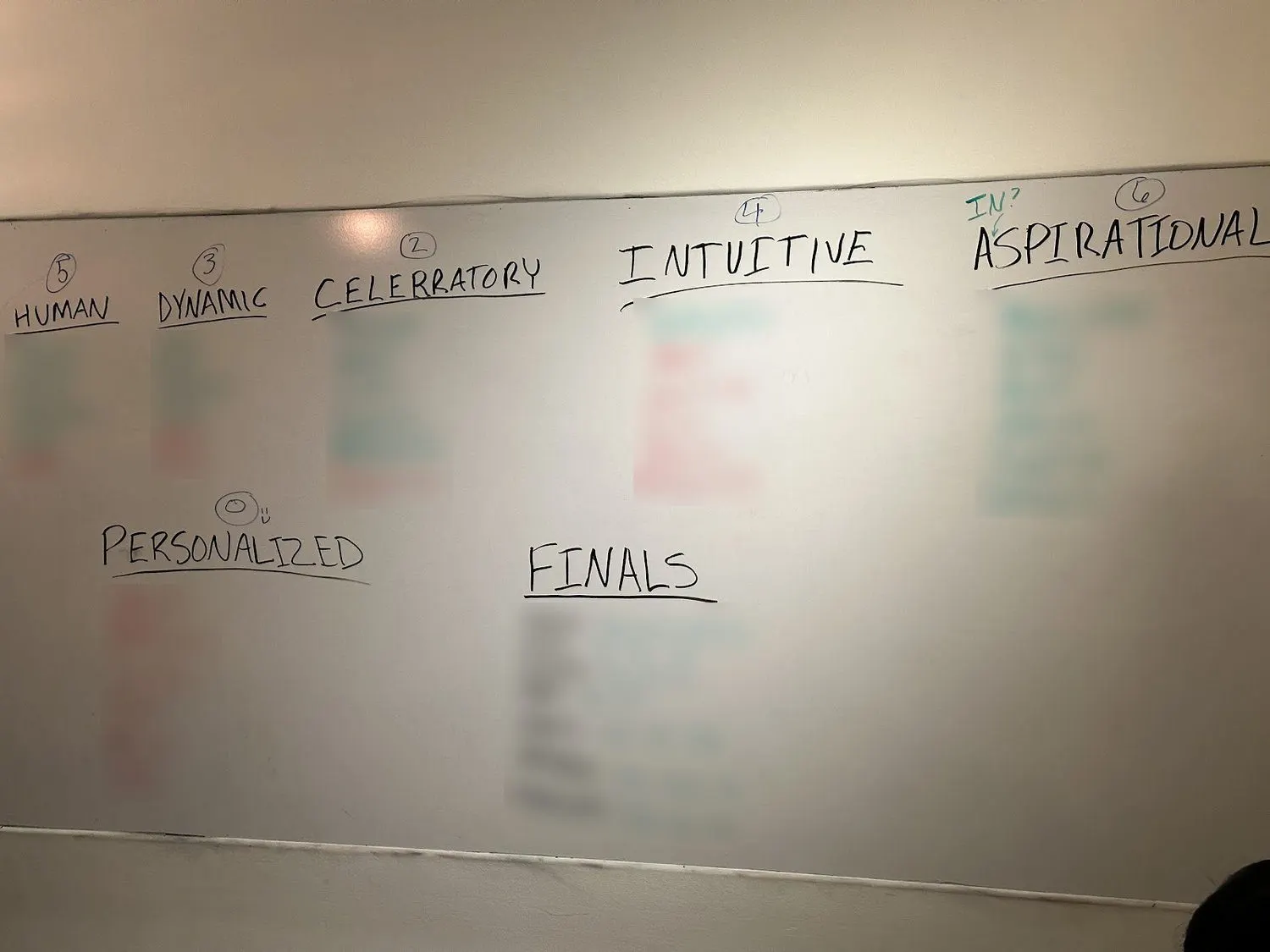
Our on-site in early 2023, voting on design principles. Human, dynamic, celebratory, intuitive, aspirational, personalized. I blurred the names on the board.
Past design systems failed because nobody owned the hard first part. So we dedicated two people to it.
As of mid 2022, design and engineering each had their own set of components. Neither was complete. Even the names disagreed: an "h1" meant different things on each side.
This wasn't only tidiness. A designer would add a new pattern, an engineer would assume it already existed and estimate low, and the release would slip. Teams kept reinventing the same things. A standard form screen once took more than two sprints to get right, because we had never agreed on what a form was.
Earlier tries had failed because nobody was dedicated to the hard first part. So the proposal with engineering was simple: one designer and one engineer, focused, until a single source of truth existed. After that, everyone could help.
- Phase 1: foundations
- Research the tools, connect Figma and the Hyperview code, document everything in one place in Storybook, and prove it on core pieces like type and buttons.
- Phase 2: execution
- Port components one at a time. A designer writes the spec, engineers build it and migrate every old copy.
- How we'd know it worked
- Designers start new Figma boards using only the system. Developers translate them to code efficiently.
- Hack week
- In January 2023, designers and engineers spent a week learning what a design system is and how ours worked, then added components with their own hands. It ended with certificates of completion.
- Tokens and naming
- Naming conventions, a token schema, and every Figma component rebuilt to the latest standards.
- Built for what's next
- Dark mode, a rebrand or a change of type would become small jobs. Accessibility standards for every component.
- Credit
- A designer on my team drove this day to day, with an engineer as partner. I wrote the master plan and led the investment with engineering. My resume says it greatly increased efficiency and consistency. I don't have a number for that.
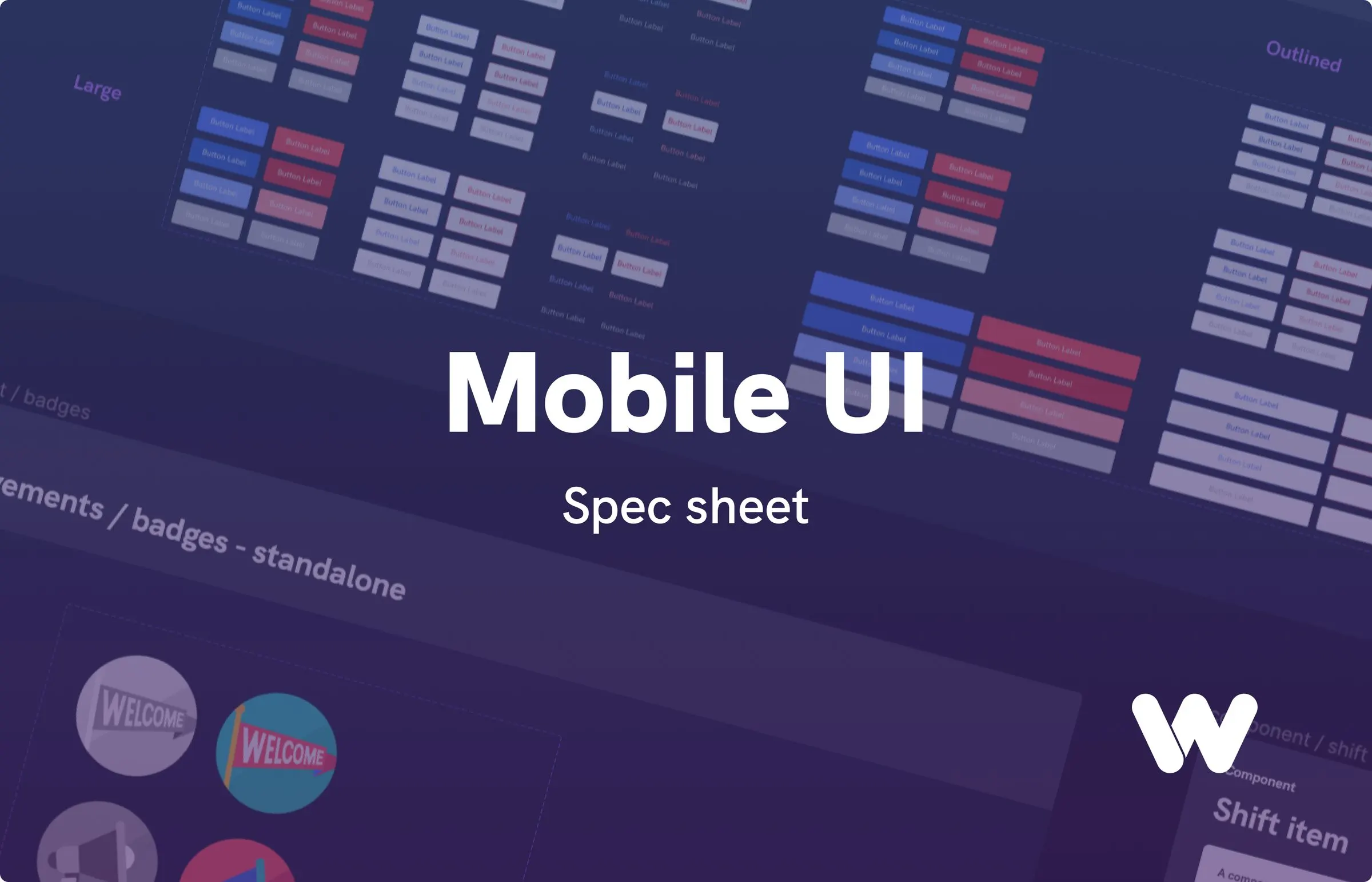
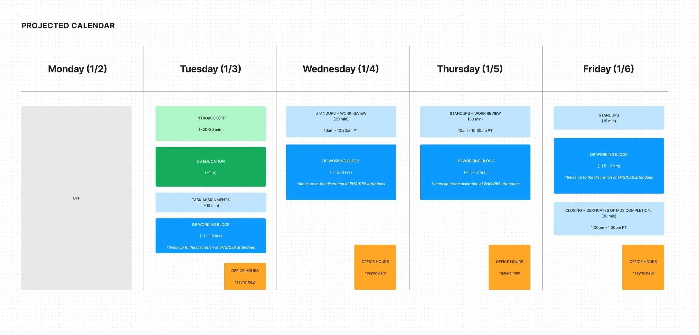
One source of truth: spec sheet covers from the file system we cleaned up, and the hack week where engineers added components themselves.
We gave our best file away, and it showed outsiders who we were.
One of our team values was to post work publicly and enrich the design community. As a team matures, it should share what it learns with other teams.
We published our Design File Toolkit to the Figma community. By Q3 2022, it had 220 duplications, which I called a small but meaningful start. It went past 300.
It paid off in three ways. The people who wrote it learned it deeper. The whole team used the same assets right away. And it showed outsiders what kind of team we were, which helps when you're hiring.
We started asking how AI would change design early, when it was still messy.
When Stable Diffusion came out, the team opened a FigJam board called AI/ML Playtime. Two questions at the top: what tools should we look at, and how can we use them? Someone asked an AI whether it would replace product designers, and pasted in the answer. Someone else wondered about using it for profile photos.
This was early, and it was messy. Nothing on this list was a shipped result. But the team was already asking how AI would change how design gets done, and that's where I've spent my time since. Later, at SchoolAI, I built Lightspeed.
- Image models
- Comparing Stable Diffusion, DALL-E 2 and Midjourney. We noticed open source meant you could build a whole product on it.
- Figma to UI, by API
- A colleague demoed generating UI through the Figma API. I put it in the design system plan as our "go big or go home" goal.
- Writing with AI
- Writer in our toolkit, and a plan to train AI writing tools on real samples, once we'd defined our voice and tone.
- Conversation first
- A process for conversational interfaces: write the full interaction as a script between two humans, then replace one human with the device.
We were remote most of the year, so when we met, we made it count.
"Have fun" was on our list of team values, with the note that we'd get together several times a year to play, explore and experiment. Jokes were explicitly allowed.
We were remote and async across time zones most of the year. This was the part I liked most.
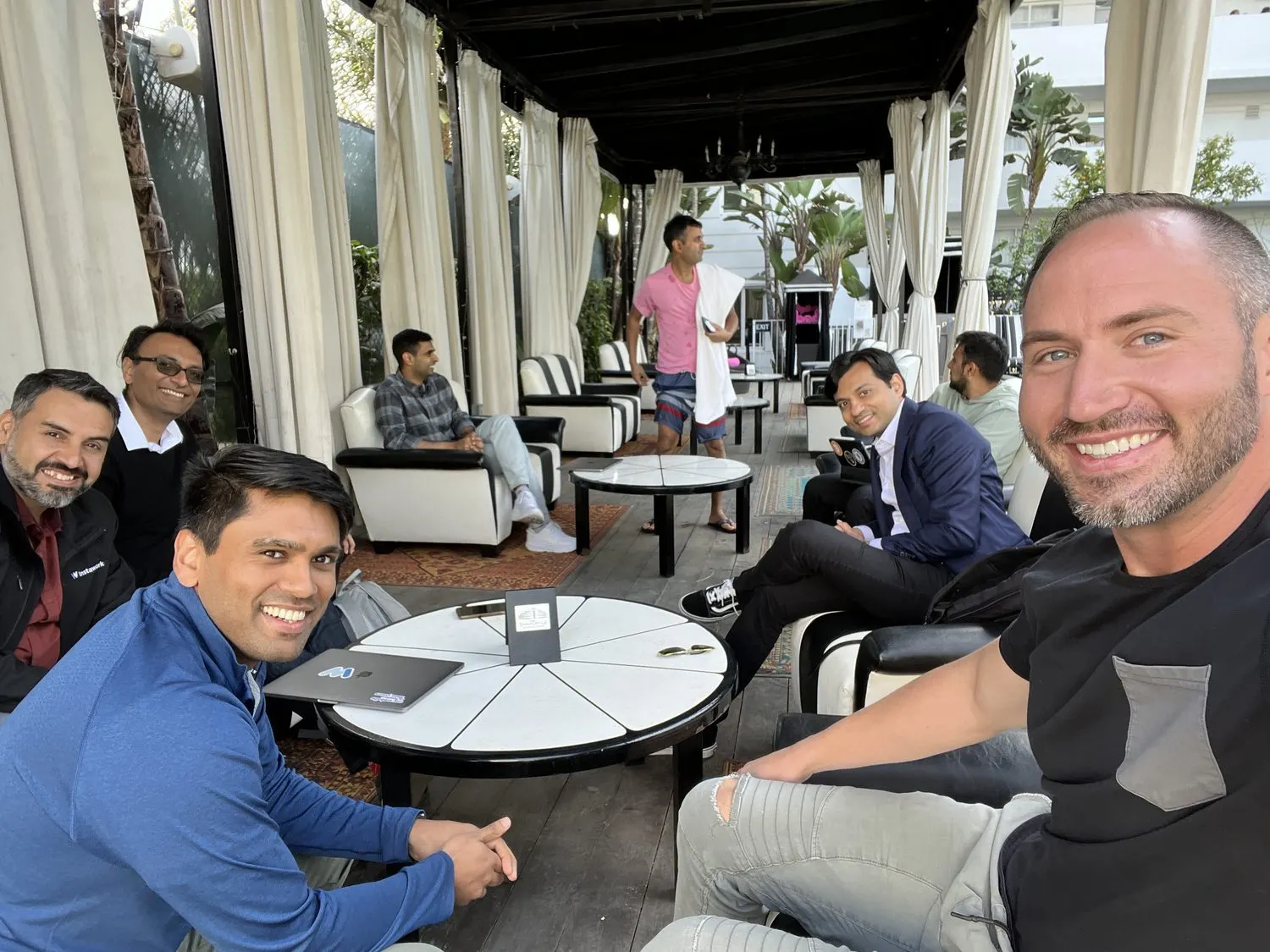
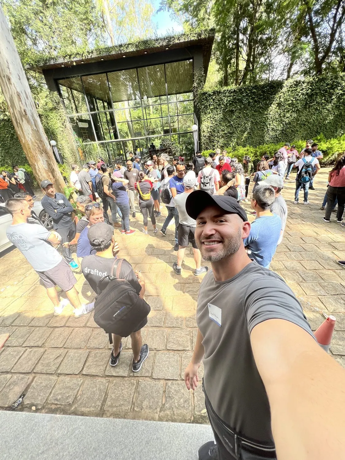
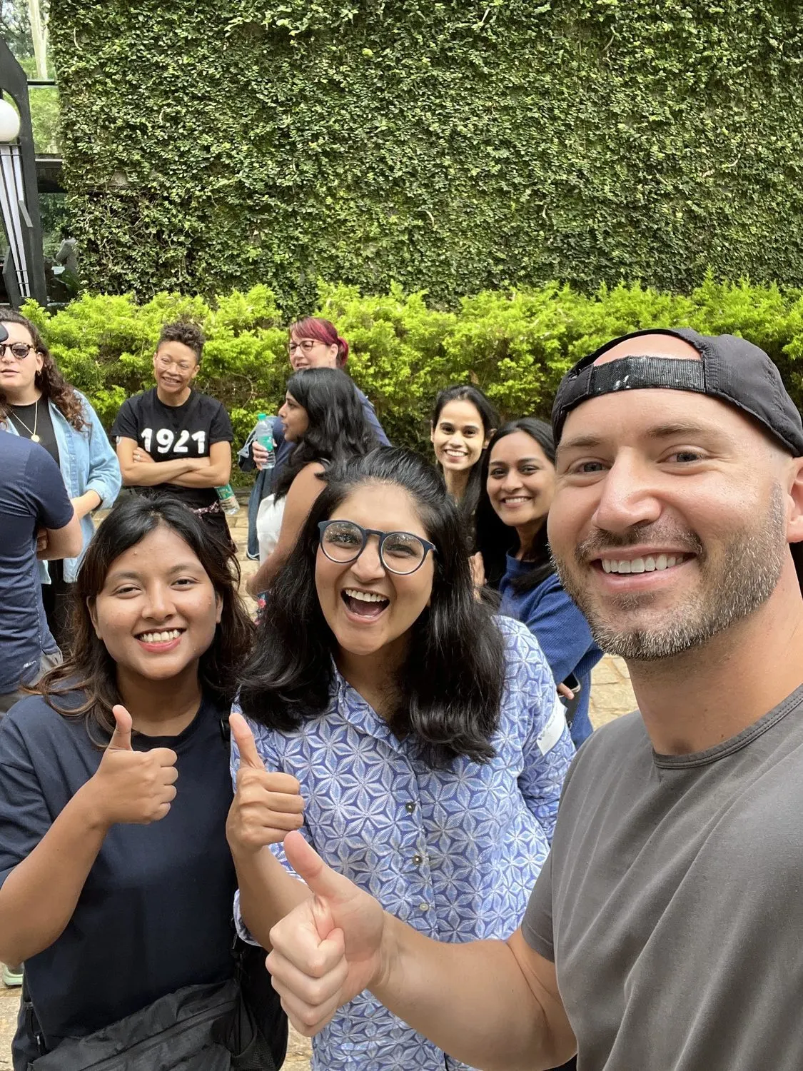
The core product and design leadership team on a patio, team building in a courtyard, and a design team outing.
What didn't go as planned
- Recruiting was slow, and design stayed a bottleneck for longer than I wanted.
- We didn't make the progress on information architecture I'd hoped for in that first year. I said so in writing at the time.
- Scale broke things. In 2021 we had plenty of inconsistency, including basic mistakes in writing, spelling and grammar.
- We slowed hiring in 2022 as a recession looked likely.
- I set goals for a design blog, a team Twitter account and a public design site. I can show you the toolkit. I can't show you the rest.
- Our design principles took a long time. We were still voting on them in 2023.
- I don't have a retention figure, or a number for what the design system saved.
Building a team that has to move fast?
I've done it from two people and from one. I can help you set the bar, hire for it, and put AI into how the team works.
Start a conversation