
We freed $15M in cash flow, then gave pros a card that pays them the moment they finish.
At Instawork, one hour with accounts payable led to an invoice redesign that cut days sales outstanding from 180 to under 30 and freed $15M in cash flow. From 2021 to 2023 my team also designed the Instawork Card, new payment choices and Top Pro rewards for pros, and in testing 91% picked the card as the fastest way to get paid. Here's how we did it, and the decisions that made it work.
What happened.
Days sales outstanding fell from 180 days to under 30, which freed $15M in cash flow. None of it was a new feature. For pros, the new payment settings tested at 4.9 out of 5 for ease, and 91% picked the Instawork Card as the fastest way to get paid.
The first two numbers are cash. The rest come from surveys and prototype tests with small groups, so read them as signals and not as proof at scale.
The card went from a picture in a story to real screens in 2022, with rewards deciding who got it first.
The biggest fix started with one hour in accounts payable.
Days sales outstanding measures how long money takes to arrive after you've billed for it. Ours was 180 days. That's six months of waiting for money already earned.
I spent one hour with accounts payable. Then we redesigned the three things that came out of that hour: invoice notifications, banners and the payment experience.
DSO fell from 180 days to under 30. That freed $15M in cash flow.
None of it was a new feature. It came from sitting with the people who deal with the bills, then fixing what they see. It's why I start every job the same way. There's more on that in I take the job, and in how QR check-in came out of a stadium shift.
- Invoice notifications
- The message that tells someone a bill exists and is due.
- Banners
- Reminders inside the product, where people were already working.
- Payment UX
- The steps it takes to actually pay.
The card started as a drawing in a story.
In 2021 I ran a storyboard exercise with the CEO and VP Product to picture Instawork two years out. That's the North Star. One of its characters is a mom of two who works shifts. In her story, she gets paid instantly to an Instawork debit card that helps her build credit.
In February 2022 we turned that into the wallet prototype above: a wallet, an earnings chart, a credit score. It was vision work, made to get a whole company picturing the same thing. It informed the final product.
As the card got real, the goals got sharper. We wrote them down in a way anyone in the room could argue with.
- Reliable instant pay
- For pros, because managing cash flow between shifts is hard.
- Cash back
- For pros, because meeting everyday expenses is hard. We started with gas and public transit.
- Low to no fee banking
- For pros, as a base to build bigger financial goals on.
- Value beyond the shift
- For the business. A reason to open the app on a day you aren't working.
- A reason to be excellent
- For the business. The best pros got the card first, which gave everyone else something to work toward.
Nobody wants surprises with their money, so we used patterns people already trust.
Going from a prototype to something that holds people's money is a lot of careful, unglamorous work. My team took it through sprints from Q3 2022 into Q1 2023.
We studied how debit and banking apps solved each problem, then used those patterns on purpose. This was the wrong place to invent new ways of doing things.
We took the beta to product review on August 16, 2022. The plan was to start with 20 Gold+ pros in the San Francisco Bay Area, make sure the flows worked and fix bugs before a wider release.
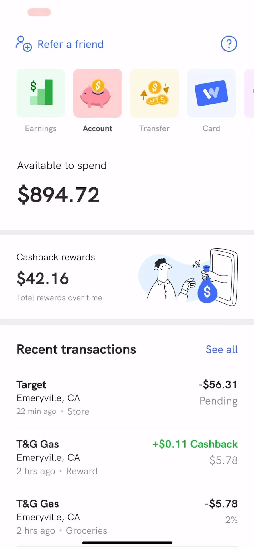
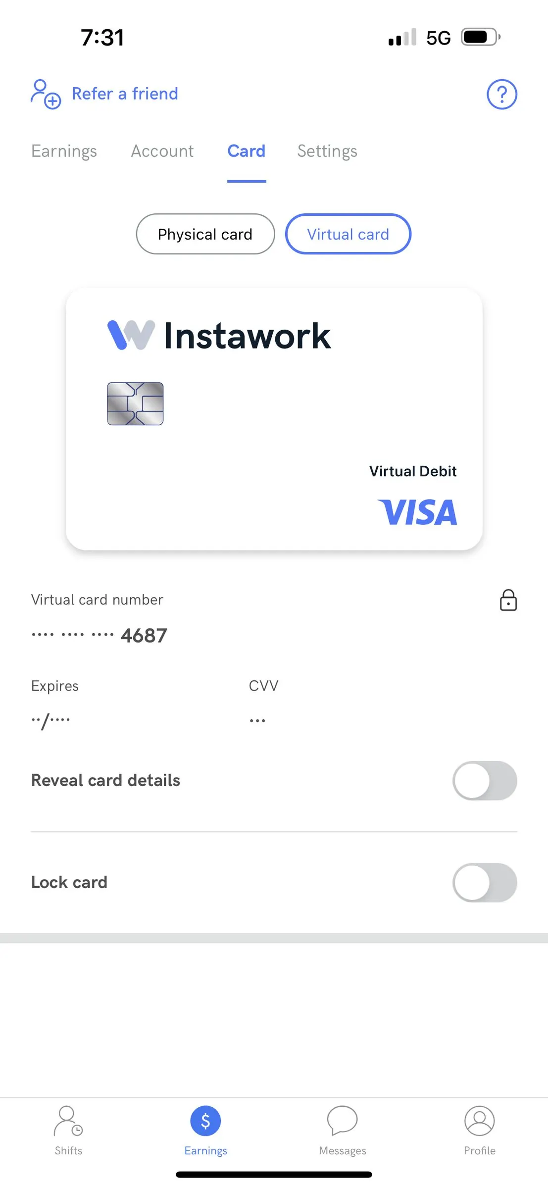
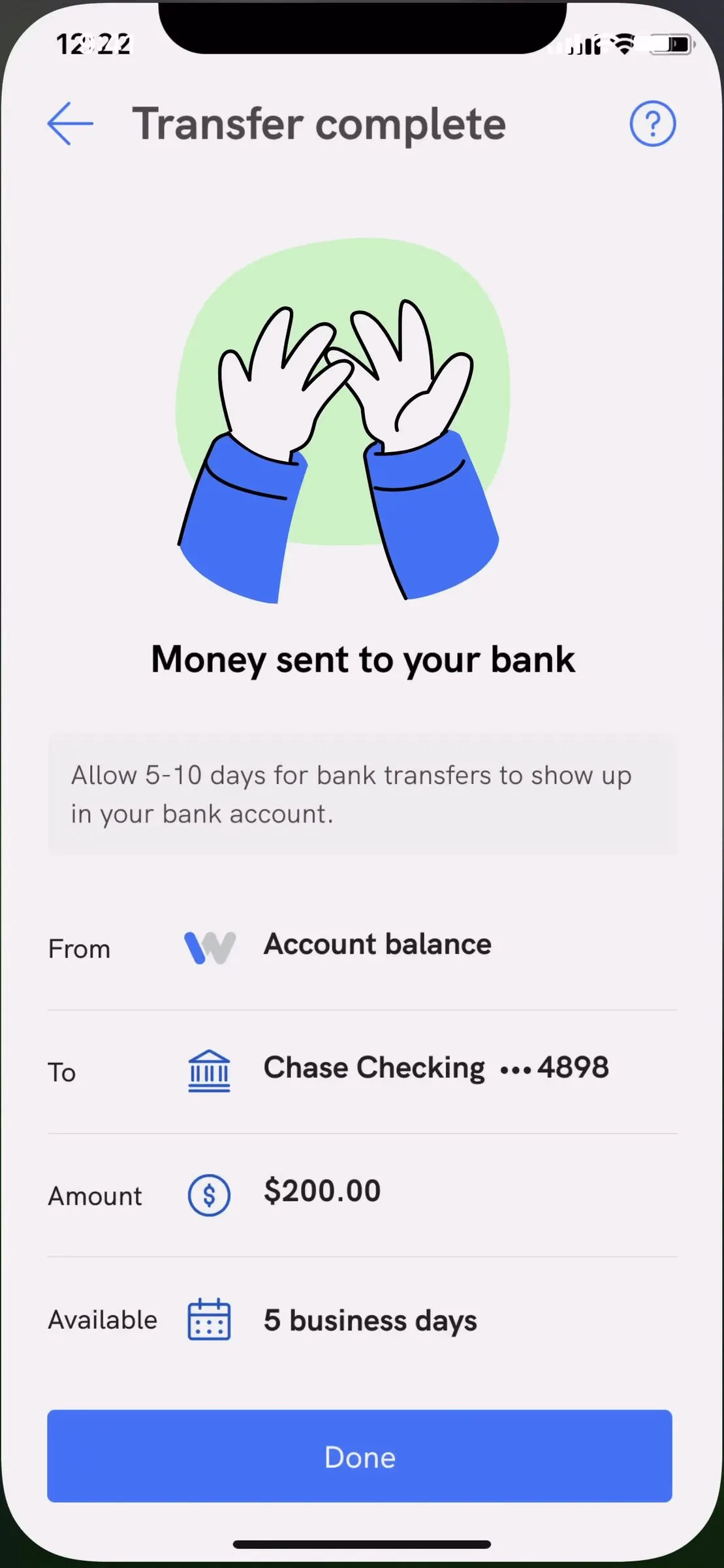
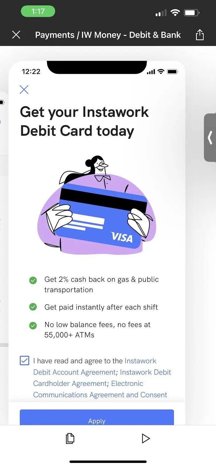
Balance, card controls, a plain transfer confirmation, and the sign-up pitch. Familiar banking patterns, on purpose. Design screens with sample data; the last is a recording of the prototype on a phone.
- Account summary
- Balance, rewards and recent activity in one place, built so it could later become a door to other products like a rainy day fund.
- Transactions
- Logos and icons on every row. Pros we tested with found their transactions faster this way.
- Virtual and physical cards
- Show card details, lock a card, change a PIN, replace a lost one. Add the virtual card to Apple Wallet and start spending before the plastic arrives.
- Applying
- A simple one-step application for eligible pros, and an extended application flow. Address verification to get the card to the right door.
- Moving money
- Transfers out, with clear timing and a plain confirmation of where the money went.
- Rewards
- Cash back shown right inside the transaction list. We also sketched rewards as their own balance that pros could build up.
- Security
- Two-factor sign-in to cut down on account takeovers, starting with emailed one-time codes, then Face ID in place of a security PIN.
- Getting the word out
- A web landing page, in-app marketing, and activation emails.
Polish is not optional.
That's from my own notes on this project, and it covered animation, sound and haptics. Payments was our first big push to bring the app to life.
Getting a debit card you've been working toward is a moment. So activation got a small animation. A small touch, so the moment felt cared for.
The engineering had to catch up. Lottie made animation straightforward, but the app couldn't do sound or haptics yet. So we asked for a reusable way to add them, so the next team wouldn't have to start over. Building the first haptics and sound became a design team goal that quarter.
"It's not shipped until a designer has seen and approved it."
Also from my notes. It became a team goal: a design QA process across every product pod by Q1 2023.
We wouldn't charge anyone for instant pay until they had a real choice.
In Q4 2022 the company made a call. Instapay, which paid pros right after a shift, would cost $3 unless the money went to the Instawork Card. The goal was to move pros onto the card.
That's a hard thing to do to someone's paycheck. And the page wasn't ready for it. Back then, if you added a debit card, instant pay just happened. You couldn't choose how often you got paid. You couldn't really see where your money was going.
So we set a rule. We couldn't charge anyone until they had a real choice. A survey backed it up: 11% of pros preferred weekly pay and another 7% wanted to choose for themselves. In the words of one pro, "Getting paid weekly."
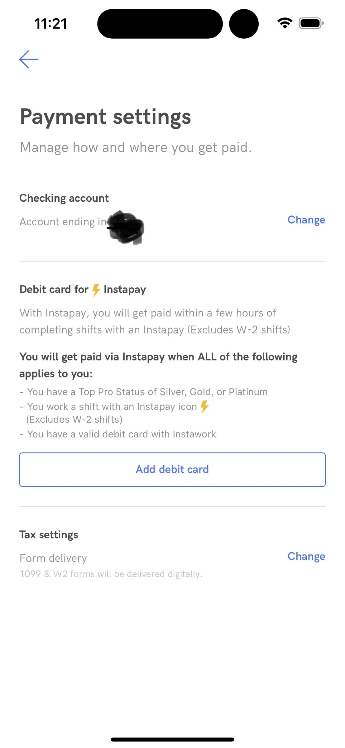
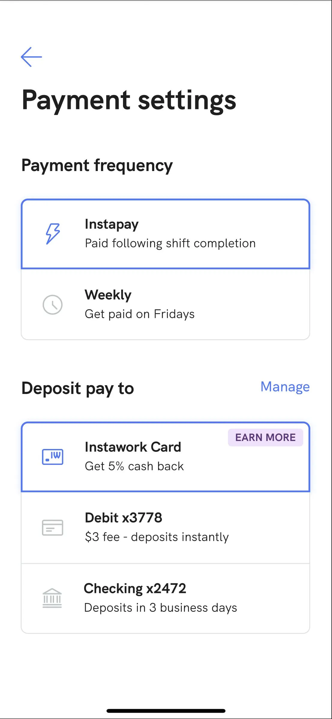
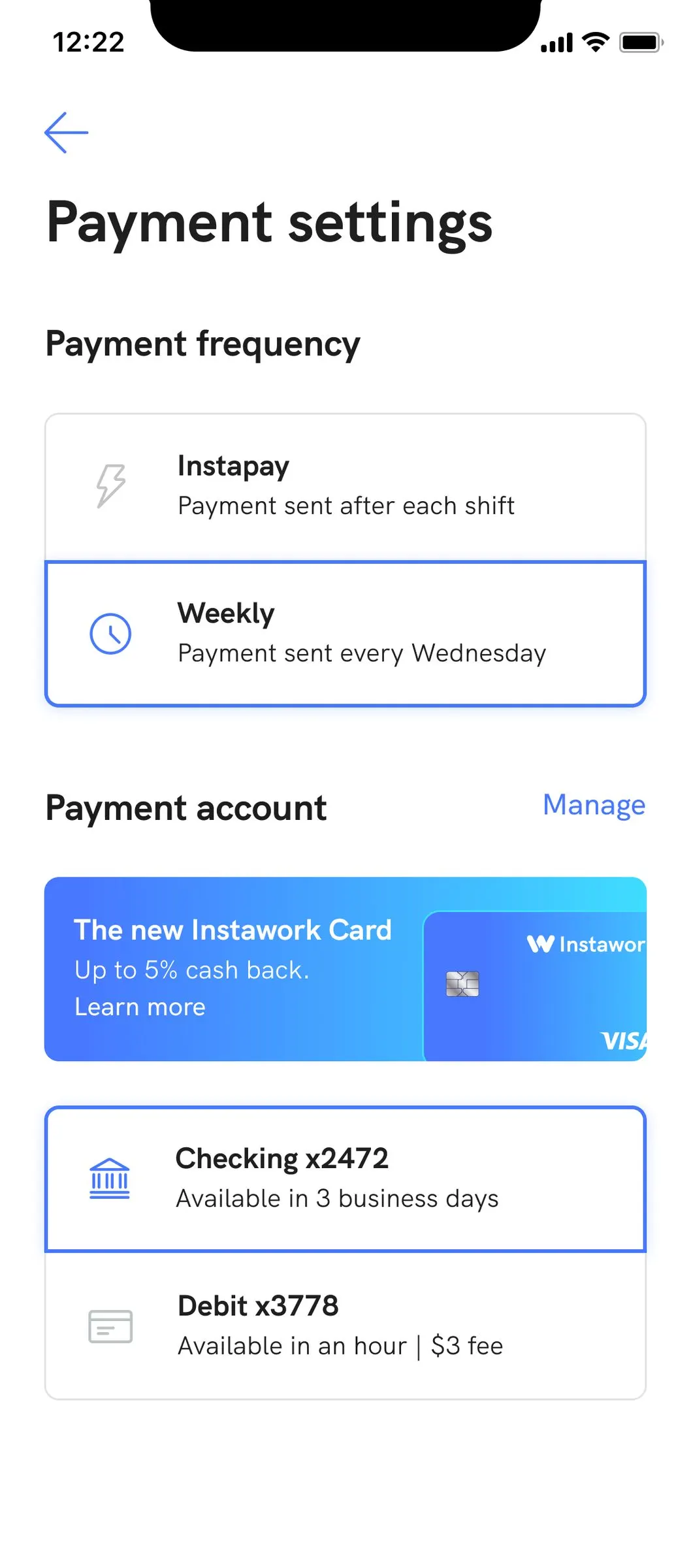
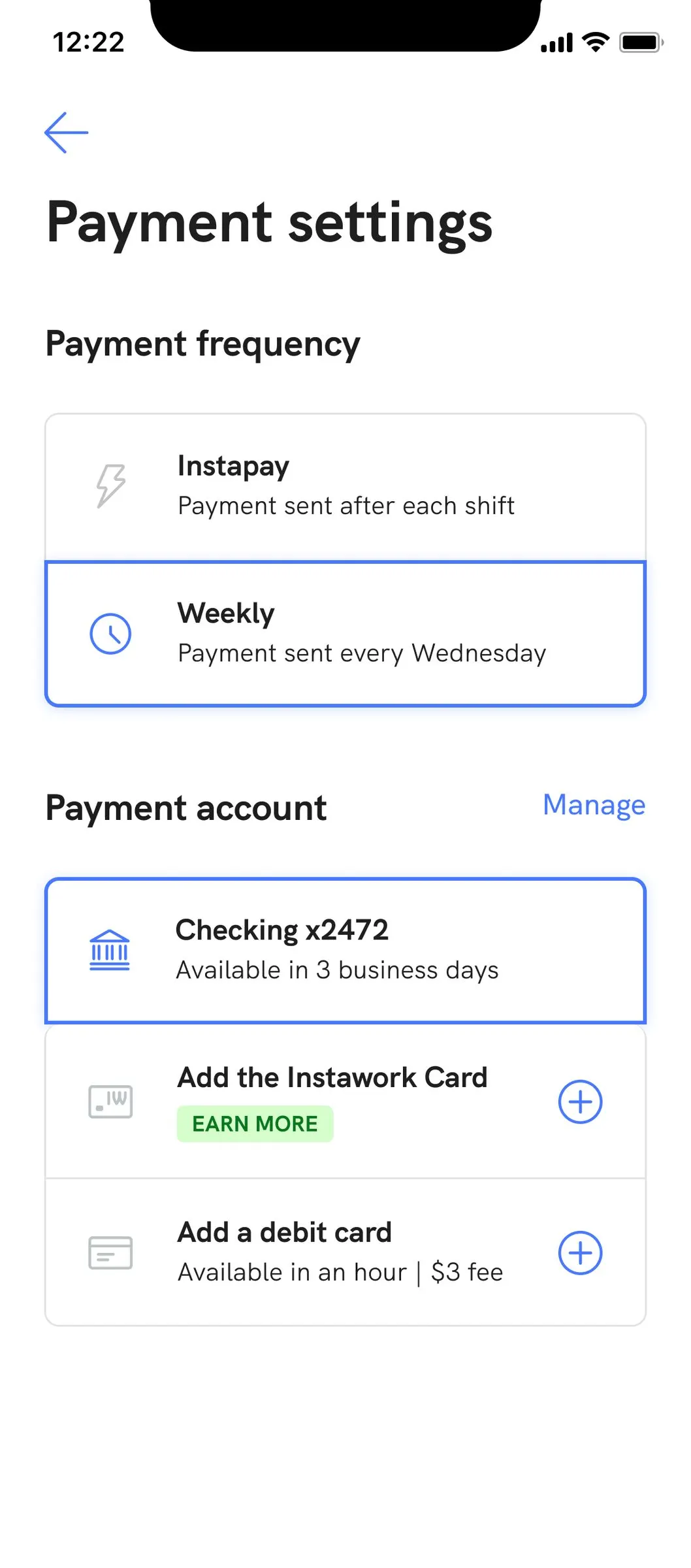
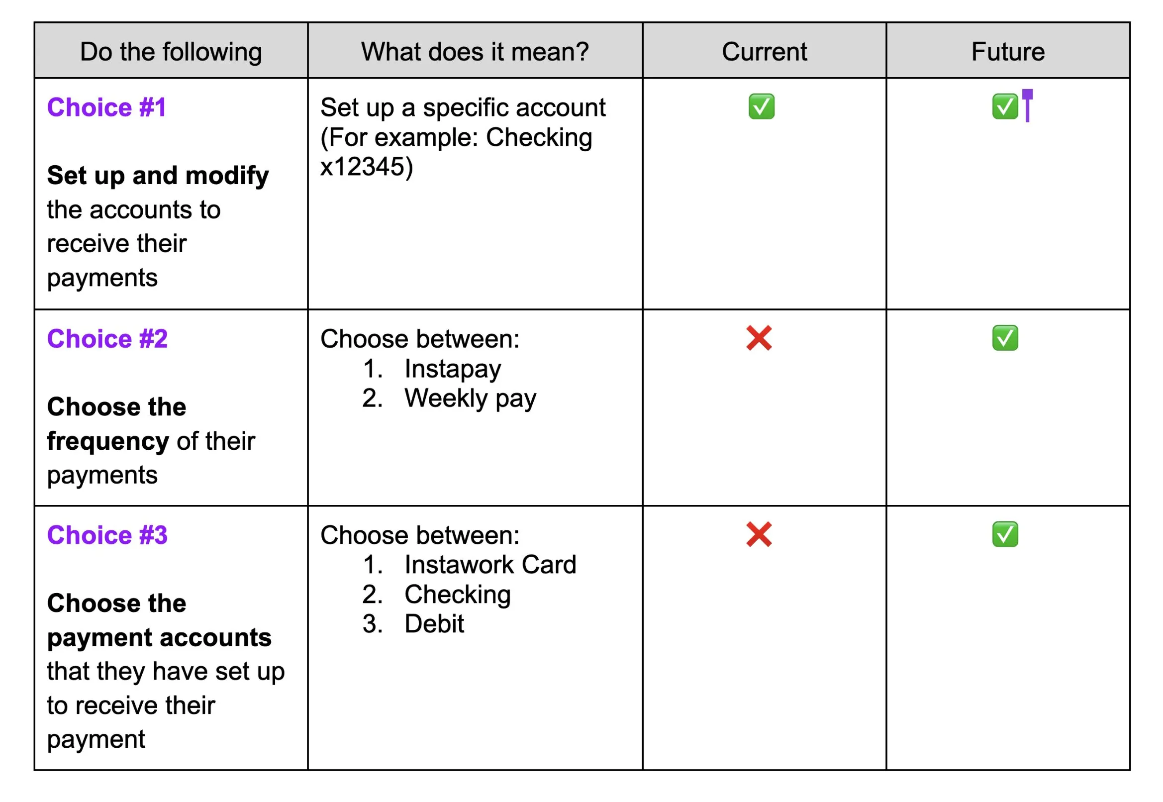
Before and after. Far left is the page as it was, with an account number scribbled out in our own deck. The next three are concepts from the February 14, 2023 review. The table is the argument in one picture: pros could do one of these three things, and they needed all three.
A simple page, with six stories behind it.
One settings page had to work for six different people, depending on their Top Pro level and whether they had the card. Most of the "tons of iterations" in my notes were about these cases, and about what happens when someone loses a status they had.
- A brand-new pro
- No accounts yet. Needs a simple way to add one, and to understand the choices.
- Newly Silver
- Just earned instant pay. Needs to know it exists and what it costs.
- Newly Gold+, no card
- Now eligible for the Instawork Card. This is the moment to offer it.
- Newly Gold+, with the card
- Should get the full benefit with no extra steps.
- Dropped to Silver
- Lost a status. Mustn't be surprised by what changed.
- Dropped below Silver, with the card
- No more instant pay, and a card still in their wallet. The hardest case to explain kindly.
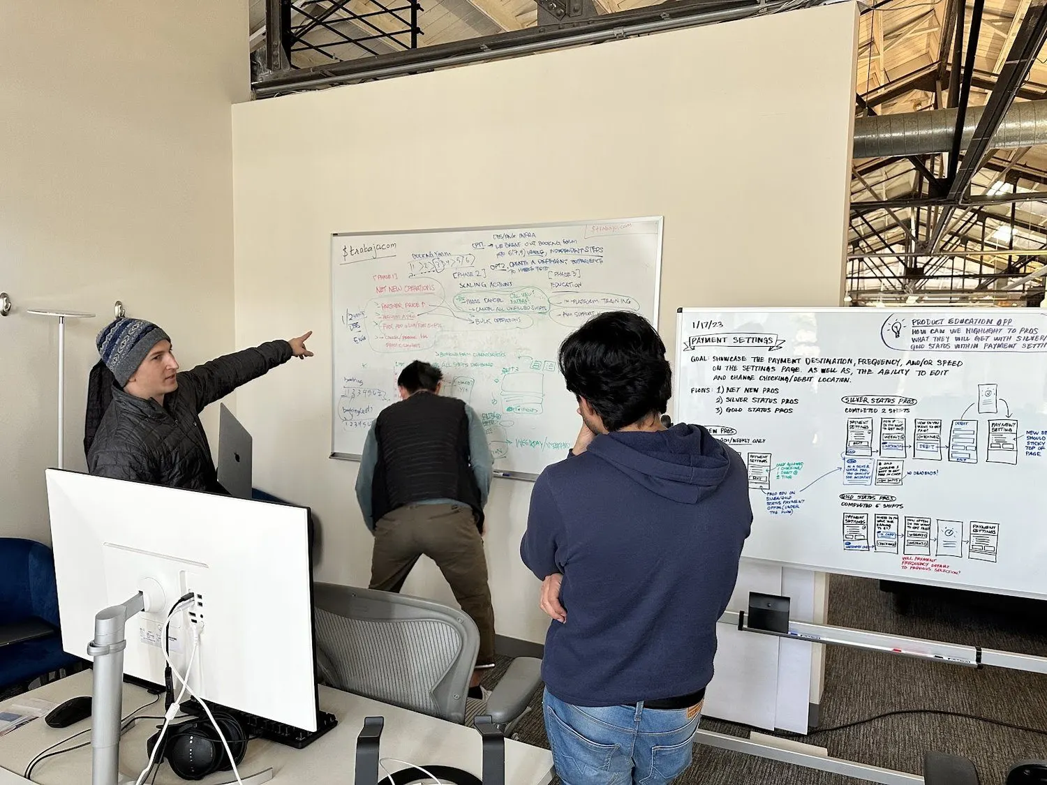
Working out the six cases on the board at our team on-site. On the right: Payment Settings flows for new, Silver and Gold pros.
We tested it before anyone built it, and pros found it far easier.
We ran it as a prototype test in Maze in February 2023. Small groups, real tasks. Pros found the new page much easier than the old one, and they understood what the card was for.
- "Modify your Payment Settings"
- 89.7% average success, 10.3% bounce, 13.4 seconds on average. 44 testers.
- "Change your payment schedule to after every shift"
- 80.0% success. The weakest of the three tasks.
- "Change where your deposit goes to your Instawork Card"
- 85.7% success.
- How easy was it?
- 4.9 out of 5 for the new page, with 91% choosing 5. Pros rated the old page 4.0 for ease of changing settings.
- Instapay or weekly?
- 74% preferred Instapay, 23% wanted both, 3% weekly. So choice mattered to a minority, and it was the right minority to protect.
- Fastest way to get paid?
- 91% picked the Instawork Card. The nudge was landing.
- A new standard
- We proposed the settings pattern as a new design system standard, so other pages could use it.
Top Pro gave the best pros a reason to stay the best.
Top Pro is the rewards program: Bronze, Silver, Gold and Platinum, earned month by month. Better levels got earlier access to shifts, pay bonuses and instant pay. Late cancellations and missed confirmations cost you.
It tied everything on this page together. The card went to Gold+ first, so working well unlocked better ways to get paid.
By mid 2022 the first version had stopped doing its job. We previewed a strategy for the weekly product review on July 7, 2022, and asked whether everyone agreed we should expand it with more game mechanics. The advice we got back: open with the nightclub metaphor, to set up why the current program wasn't working.
The medal in the December 2022 clip above is a small animation for our Gold pros. Our first motion in the app shipped for Top Pro and referrals.
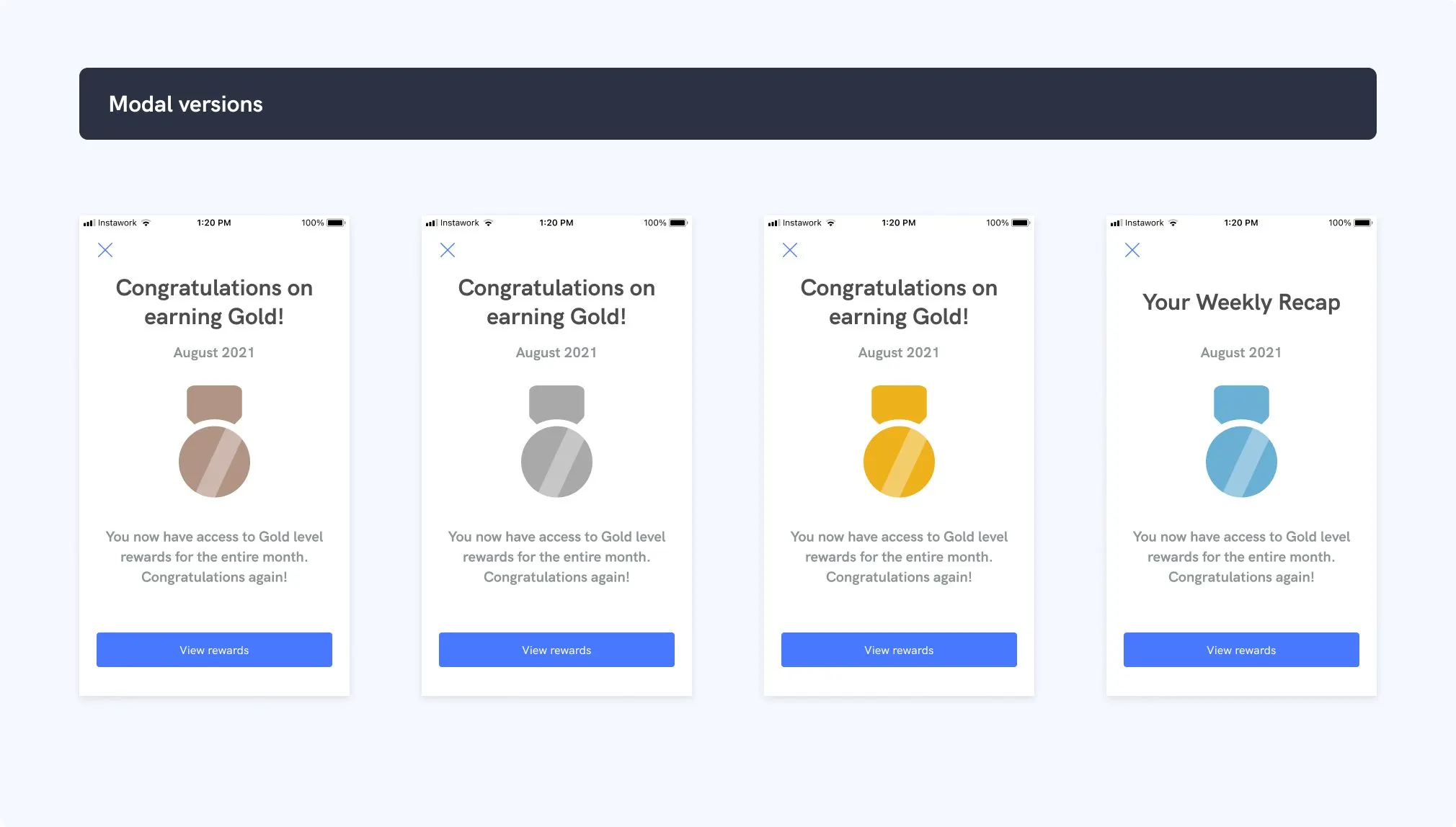
Monthly recap concepts, one for each moment a pro earns a level. Working well should feel like it.
Referrals: show people exactly where their money is.
This work began as part of a project to reduce support tickets. The demo that started it came from Fullstory Friday, where we watched real sessions together.
A designer on my team led it. The fix was plain: say exactly where each referral stands, every step of the way. There was also an idea to make sharing a shift generate a QR code and a link.
Eight steps, each one named, from invite to bonus paid.
What it all added up to, and what I can't prove.
Over 18 months, pros on Instawork went from 400K to 4.5M. I connect that to the North Star and the product loops that came from it, with Top Pro and referrals among them. I can't give you a number that isolates either one, and I won't pretend to.
I led the org. Most of these screens came from my team.
I led the design org. Most of these screens came from the talented people on it, and I want that to be clear.
- Me
- The North Star vision and the first prototype's direction. The hour with accounts payable. The quality bar and design QA. The argument for nudging with no surprises. Shaping how this work was presented in product reviews.
- Physical card
- A product lead, a designer and I worked on the next generation of the physical card. Card makers sent samples, including metal, to me and our San Francisco office.
- Payment Settings
- One designer led it first and handed it to another, who also led the Payment Details page. A product manager ran it with them, and our researcher did the research.
- Referrals
- A designer on my team, with engineers.
- The money side
- Finance and product partners did the funding and economics work.
- Figma, FigJamDesign files, flows, prototypes
- MazePrototype tests
- LottieAnimation in the app
- HyperviewThe app framework we designed for
- FullstoryWatching real sessions together
- Apple WalletSpend before the card arrives
What I can't show you, and what didn't go well
- The $15M is my own account of it. I don't have the invoice screens or the chart in my files, so there's nothing on this page to look at.
- The Payment Settings numbers come from a prototype, with 35 to 47 responses on most questions. I don't have adoption numbers for it, or for the card.
- One task had a 55.1% misclick rate. Pros got there, but they tapped around first. The page was easier, and it still wasn't simple.
- When we asked about 200 pros to join the card beta study, only 25% completed the consent form. Getting people to try a new bank account is hard, even when it's better for them.
- I don't know whether the next-generation physical card design shipped.
- Reviewers asked fair questions: why offer weekly pay at all, and hasn't someone already solved this? They were right to ask.
Give me an hour with the people doing the work.
Accounts payable, a warehouse crew, a teacher. That hour is usually where the real problem is. Then I can help your team design it, test it and ship it.
Start a conversation